Accessibility fixes for AI-generated frontends: quick wins
Accessibility fixes for AI-generated frontends: quick automated checks plus a short manual review to fix labels, focus order, and keyboard traps fast.
What breaks first in AI-generated frontends
“Quick wins” are fixes that take minutes, not days, but change the experience right away. They’re often small HTML and interaction tweaks that remove blockers for keyboard users, screen reader users, and anyone who navigates carefully (including plenty of power users).
AI-generated UIs can look fine in screenshots and still fail in real use. Speed is usually the culprit: components get stitched together, defaults pile up, QA gets skipped, and the generator rarely tests with a keyboard or a screen reader. The result works if you click perfectly, but falls apart when you tab, zoom, or use assistive tech.
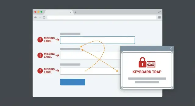
When these issues show up, users don’t think “accessibility bug.” They think “this app is broken.” You’ll see things like unlabeled fields, focus jumping around, modals you can’t escape, buttons that have no meaningful name, or errors that are only shown in color.
The biggest return usually comes from three areas:
- Clear labels and accessible names
- A focus order that matches how the page is read
- No keyboard traps
The workflow is simple: run one automated scan to catch obvious problems, then do a short keyboard-only pass (tab through the page, open and close dialogs, submit a form) to confirm the flow works.
Automated checks vs a short manual review
Automated testing is the fastest way to surface common issues, especially on AI-generated UIs. It produces a concrete list you can work through quickly, and it’s great at spotting missing labels, contrast warnings, ARIA misuse, duplicate IDs, and empty icon-only controls.
What automation can’t tell you is whether the app feels usable. It won’t reliably catch a confusing tab path, a modal that opens without receiving focus, or a dropdown that reads nonsense to a screen reader. It also can’t judge whether announcements are clear or misleading.
A practical two-pass approach works well:
- Run tools first to get obvious errors.
- Do a 5-10 minute keyboard review of one key flow (signup, checkout, submit a form).
During the manual pass, focus on blockers:
- You can reach every interactive element with Tab and Shift+Tab
- Focus is always visible
- Focus moves into modals and returns to the trigger when they close
- Menus, selects, and dialogs work without a mouse
- You never get stuck and need a refresh to escape
Fix “can’t proceed” items first (missing labels on required fields, focus lost in a modal, keyboard traps). Save smaller issues (extra ARIA, imperfect heading order) until the flow works end to end.
Step-by-step: run automated accessibility checks
Automated checks won’t catch everything, but they quickly surface missing names, contrast issues, and broken patterns you can often fix in a day.
Pick 1-2 checks you will actually keep using
Stick to a small, repeatable setup. Switching tools constantly creates noise and makes progress hard to measure.
A simple combo:
- One in-browser audit for quick feedback (Lighthouse or axe DevTools)
- One “always-on” code check (for React/Next.js,
eslint-plugin-jsx-a11yis a common choice) - Optional: a repeatable test check (axe-core in unit or end-to-end tests)
Run it on the screens that matter
Don’t scan everything first. Start where users must succeed to get value: login, signup, checkout/payment, settings, and the main workflow screen.
When you read the report, separate signal from noise. Prioritize errors over warnings, and look for repeats. If the same issue appears dozens of times, it’s often one shared component (Button, Modal, Input) causing it.
Capture a short list you can actually finish this week, and make each item testable. Examples:
- “All required inputs on Signup have a visible label and a correct accessible name.”
- “Modal closes with Escape and focus returns to the open button.”
Fix missing labels and accessible names
This is one of the fastest, highest-impact fixes. If a screen reader can’t tell what something is, the user is stuck. Even for sighted users, placeholders aren’t enough because they disappear as soon as someone types.
Common failures include:
- Placeholder text used as the only label
- Icon-only buttons (trash, pencil, eye) that announce as “button” with no meaning
- Custom widgets that hide the real input or break naming when rebuilt from divs
What good looks like is straightforward: every input and control has a clear name that matches what it does.
Quick fixes that usually take minutes:
- Pair a
<label>with its input usingforandid, or wrap the input inside the label. - Keep label text specific (“Work email” is clearer than “Email” if you have multiple).
- For icon-only buttons, add an accessible name with
aria-label="Delete"only when there’s no visible text. - If a control already has visible text, avoid adding an
aria-labelthat changes what assistive tech reads. - If you’re naming a control from existing text on the page, prefer
aria-labelledby.
A fast manual check helps: tab to each control and ask, “If I couldn’t see the screen, would this name make sense?”
Get focus order working in real use
Focus order is what makes an interface usable without a mouse. If the tab path feels random, people miss fields, trigger the wrong action, or get stuck and leave.
AI-generated UIs often look correct visually while the focus path tells a different story: focus jumps across the page, skips sections, lands on hidden elements, or seems to “disappear” because the focused element has no visible style.
Most fixes are structural:
- Keep DOM order aligned with visual order. If layout is rearranged with grid or flex, don’t shuffle interactive elements into a confusing source order.
- Avoid positive
tabindexvalues (liketabindex="5"). They create a fragile maze that breaks the moment someone adds or removes a control.
For dialogs and menus, treat focus as a loop with a clear return:
- On open: move focus into the dialog (often the heading or first field).
- While open: Tab stays inside.
- On close: focus returns to the trigger.
A quick manual pass takes two minutes: tab through the page, Shift-Tab back, then repeat while opening dialogs, dropdowns, and side panels. Watch for focus landing behind overlays or on hidden elements, and confirm you always have a visible focus indicator.
Remove keyboard traps (the fastest trust-killer)
A keyboard trap is when someone can Tab into a widget but can’t Tab out. It sounds small, but it makes an app feel broken immediately.
This often happens in custom dropdowns, carousels, overlays, and homegrown modal systems where interaction rules are missing or inconsistent.
Fix the escape route first
Most traps go away when you add one predictable exit and keep focus behavior consistent:
- Provide a real, focusable close button (a
<button>, not a<div>). - Let Escape close the modal/menu/popover.
- When it closes, return focus to the control that opened it.
- Don’t trap Tab inside a widget unless it’s a true modal dialog. If you do trap focus, closing must always be available.
A common example: a “Country” dropdown built from scratch hijacks Tab and drops focus into a list you can’t leave. The fix is usually to stop overriding Tab, let Tab move to the next field, and reserve arrow keys for moving within the open list.
How to test in under 2 minutes
Tab through the whole screen (including menus), Shift-Tab back, press Escape whenever something is open, and confirm you can always leave dropdowns and lists with Tab.
Tidy up ARIA and semantic HTML without overdoing it
A lot of cleanup comes from one habit: using ARIA to patch problems that plain HTML already solves. Native elements come with keyboard support, roles, and naming built in. ARIA should fill gaps, not replace basics.
Prefer native elements first
If you need a button, use <button>. If you need a heading, use <h2> or <h3>. Clickable <div> and <span> elements often lead to broken keyboard support, missing focus styles, and confusing screen reader output.
A simple rule: if a native element works, don’t replace it with a custom div.
The ARIA mistakes that cause the most harm
Many issues aren’t “missing ARIA.” They’re “wrong ARIA.” Common problems include putting role="button" on everything, hiding interactive elements with aria-hidden="true", or adding multiple labels so screen readers repeat themselves.
High-impact cleanups:
- Remove unnecessary
roleattributes when the element already has the correct native role. - Never use
aria-hiddenon something a user can click, tap, or focus. - Make sure each control has one clear, unique accessible name (avoid double-labeling).
- Use
aria-liveonly for real status updates (errors, save confirmations). - Verify announcements by triggering the behavior, not by reading attributes in code.
A typical modal fix: keep role="dialog", switch the close icon to a real <button>, and connect the dialog to a visible title via aria-labelledby. That often improves both keyboard and screen reader behavior with minimal code.
Example: fixing a signup flow in under an hour
Pick one realistic path and stick to it. Example: a new user signs up, lands on a welcome screen, opens a profile modal, edits their name, and saves.
Before the fix, it “worked” with a mouse but fell apart on a keyboard. An automated scan flagged some items, but the real problems showed up in a 5-minute tab test:
- Email and password inputs had placeholders but no labels, so screen readers announced “edit text.”
- Tab order jumped into the footer, then back up to the form.
- The profile modal didn’t manage focus correctly, so you could tab into the page behind it.
- Focus styling was missing, so you couldn’t see where you were.
The fixes were small and compound quickly:
- Add proper labels (or
aria-labelonly when a visible label truly isn’t possible). - Remove positive
tabindexvalues and keep interactive elements in DOM order. - On modal open, move focus to the first field; on close, return focus to the trigger.
- Support Escape to close, and keep focus inside the modal while it’s open.
- Restore a clear focus style so keyboard users can track movement.
Total time: about 45 minutes (20 minutes finding issues, 25 minutes fixing and retesting). The biggest change was trust: users could complete signup without guessing, and the automated report dropped from multiple errors to a short list of manageable warnings.
Common mistakes that make accessibility worse
Automated scanners help, but they don’t define usability. It’s easy to chase a “zero warnings” score while missing real blockers: controls you can’t reach by keyboard, broken focus handling in modals, or form errors that are never announced.
Another mistake is sprinkling aria-label everywhere to silence warnings. Screen readers announce what you give them, so a quick patch can make the experience worse. If a control already has visible text, adding an aria-label can create confusing or duplicated announcements.
Positive tabindex is also a tempting patch that breaks later. If the order is wrong, fix source order or layout instead. Use tabindex="0" only when you truly need to add a custom element into the natural flow.
Overlays are a frequent failure point: focus disappears, lands behind the overlay, or returns to the top of the page after close. Watch for “quick fixes” that backfire, like hiding elements visually while leaving them focusable, disabling outlines instead of styling focus, or closing overlays without returning focus.
Quick checklist before you call it done
Do one last pass that matches real use. Don’t touch the mouse.
- Keyboard-only run: you can reach every interactive element, and you can always exit popups and menus.
- Forms: every input has a visible label, or at least a clear accessible name that matches what the user sees.
- Focus is obvious everywhere, including on custom controls.
- Trigger errors on purpose: messages are readable, placed near the problem, and tied to the right field so they’re announced.
- Re-test your top three user flows after each batch of changes, not just at the end.
Choose the “top three flows” based on what makes money or builds trust. For many apps it’s signup, login, and the main action (create, book, pay, send).
If the same issues keep repeating across screens, it usually points to a shared component that needs a fix. That’s the fastest way to prevent regressions.
Next steps: keep it accessible as the app grows
After the first round of fixes, the main risk is regression. A small UI tweak can reintroduce missing labels, broken focus, or a keyboard trap.
You don’t need a big program. Add a few lightweight gates that fail fast when basics break:
- Run an automated scan in CI on key pages (login, signup, checkout, settings)
- Turn on basic linting rules for label and ARIA mistakes
- Add a short “keyboard smoke test” to your release checklist (tab primary flows, open and close a modal, submit a form)
If the codebase is messy, pick your battles. Prioritize flows that make or lose trust (auth, payments, lead capture), then refactor the worst shared components first. A practical approach is to standardize a small set of “golden” components (Input, Button, Modal) and replace copies over time.
Sometimes patching costs more than rebuilding, especially with custom selects and modal systems that require lots of one-off handlers and ever-growing ARIA. If you’re unsure whether to repair or rebuild, a quick audit can save days.
If you inherited an AI-generated prototype from tools like Lovable, Bolt, v0, Cursor, or Replit and the UI is unpredictable in production, FixMyMess (fixmymess.ai) can run a free code audit to identify the core patterns behind broken labels, focus issues, and keyboard traps, then fix them with human verification so the next release doesn’t reintroduce the same problems.
FAQ
What’s the fastest way to find the biggest accessibility problems in an AI-generated UI?
Start with the first flow users must complete, like signup or login. Run one automated scan, then do a 5–10 minute keyboard-only pass to find the blockers that stop progress, such as missing labels, focus getting lost, or a modal you can’t exit.
Why do AI-generated frontends look fine but feel broken in real use?
Because screenshots don’t show interaction. Many AI-built screens look polished but fail when you tab, zoom, or use a screen reader, so users hit dead ends and assume the app is broken.
Should I rely on automated accessibility tools, or manual testing?
Do both, in that order. Automated checks quickly catch common mistakes like missing accessible names and contrast issues, while a short manual keyboard review is what reveals real usability failures like confusing tab order, bad modal focus, or keyboard traps.
How do I fix form fields that only use placeholders as labels?
Make sure every input has a visible label, not just a placeholder. Pair a real label with the input so assistive tech can announce it clearly, and keep the label text specific enough that users know what to type.
What’s the right way to handle icon-only buttons like trash or edit?
Give the control a clear accessible name that matches what it does. If there’s no visible text, adding an aria-label is usually fine, but don’t add it when visible text already exists because that can change or duplicate what screen readers announce.
How can I fix a tab order that jumps around the page?
Keep the DOM order aligned with how the page is visually read, and avoid using positive tabindex values to “force” the order. If the tab path feels random, fix the structure instead of patching it with fragile tab index numbers.
What should proper focus behavior look like for modals and dialogs?
Move focus into the modal when it opens, keep focus inside while it’s open, and return focus to the trigger when it closes. Also make sure Escape closes it and that the focused element is always visibly outlined so users can track where they are.
How do I detect and remove keyboard traps quickly?
A keyboard trap is when a user can tab into a widget but can’t tab out. The quickest fix is to stop hijacking Tab behavior in custom components, ensure there’s a real close button where relevant, and always provide a predictable Escape-to-close path for overlays.
When does ARIA help, and when does it make things worse?
Use native HTML elements whenever possible, because they come with built-in keyboard support and correct roles. The most damaging issues often come from wrong ARIA, like hiding interactive elements or double-labeling controls, so remove unnecessary roles and make naming simple and unique.
Should I fix the AI-generated code or rebuild the UI from scratch?
Not always. If you’re repeatedly fighting the same issues across screens, it usually means shared components are flawed or the architecture is too messy to stabilize quickly, and rebuilding core components can be cheaper than endless patching; FixMyMess can run a free code audit to tell you which path will be faster.