How to write release notes people actually read
Learn how to write release notes that people actually read: clear change summaries, who it affects, and what users should do next in plain language.
Why release notes get skipped
Most release notes get ignored for one simple reason: they feel like homework. People open them hoping for clarity, then hit a wall of internal language, ticket-style details, or a long list of tiny changes with no clear impact. If they can’t tell quickly whether the update affects them, they close the tab and move on.
Another common problem is a mismatch in audience. Teams write notes for themselves (what changed in the code), while readers want to know what changed in their day. A line like “Refactored auth flow and improved caching” might be accurate, but it doesn’t answer the real question: “Will this fix my login problem?”
Most readers give you about 60 seconds. In that minute, they’re scanning for a few basics:
- What changed for me (in plain words)
- Whether I need to do anything now
- If something might break, or look different
- Where the change shows up (screen, workflow, area of the app)
Release notes also get skipped when updates feel too small or too frequent. If every entry reads like “minor improvements,” people learn that opening the notes isn’t worth it. Even small UI changes can matter if they move a button, rename a setting, or change a default.
Readers still want a clear summary in a few common situations:
- Bug fix: “The export button works again” matters more than “Fixed CSV handler.”
- New feature: People want the quickest way to try it, not a full spec.
- Small UI change: Tell them what moved and why, so they aren’t hunting.
If you’re moving fast (especially with AI-built prototypes that change daily), this matters even more. When an update breaks login, exposes a setting, or changes a workflow, clear release notes can prevent a support flood and protect trust.
Start with the job your release notes must do
Release notes aren’t a history log. Their job is to prevent confusion the moment something changes. If people finish reading and still wonder, “Did this affect me?” you’ll see it as support tickets, angry replies, and silent churn.
A useful way to think about release notes: make one clear promise. Readers will quickly learn what changed, why it matters, and what to do next. Everything else is optional.
Before you write a single line, pick one reader. Notes that try to speak to everyone usually help no one.
- A trial user wants quick wins and reassurance.
- An admin wants risk, permissions, and rollout details.
- An everyday user wants a simple heads-up and zero drama.
Four quick choices keep your notes focused:
- Who is this for: everyday user, admin, or trial user?
- What do they care about most: time saved, fewer errors, or new capability?
- Where will they read it: email, in-app message, or a help center?
- What are they likely to do next: keep working, change a setting, or ask for help?
Write to reduce “What happened?” moments. If you changed your login flow, don’t lead with the technical reason. Lead with the user outcome:
“Sign-in is more reliable. If you use Google sign-in, you’ll be asked to reconnect once.”
Anchor each update to three pieces of information:
- What changed (plain words)
- Why it matters (real impact)
- What to do next (if anything)
Do this consistently and your release notes become a calm guide, not a surprise.
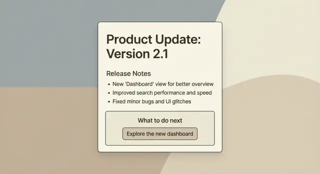
A simple structure that works every time
Predictability is what makes release notes readable. Readers should be able to scan in 10 seconds and decide whether they need to act.
A format that holds up across most products:
- Summary: one sentence that answers “What changed?”
- Details: 1-3 short sentences that answer “What does it do for me?”
- Next steps: one clear action (or “No action needed”)
Keep each item to one idea. When one bullet tries to cover three fixes, readers stop trusting it.
Write like you’re answering real user questions:
- Where will I see this?
- Will this break my workflow?
- Do I need to change anything?
- What do I do if it doesn’t work?
Limit the number of items. Most releases include more changes than anyone wants to read. Group the rest into one line like: “Other improvements: small UI fixes and performance tuning.” Save the long list for internal tracking.
Here’s what this looks like in practice:
Summary: Invites are now faster and more reliable.
Details: We fixed an issue where invite emails were delayed. If you send multiple invites, duplicates are now blocked.
Next steps: If you have pending invites, re-send them once and check the “Invited” status.
How to write a clear change summary (no jargon)
Your first line should read like a headline a real user understands in three seconds. Aim for: what changed, where they’ll notice it, and the outcome.
Good: “Checkout is faster on mobile”
Not great: “Optimized payment flow v2 (Project Falcon)”
Right after the headline, add one sentence that answers: “Why should I care?” Mention the benefit or the risk, in plain terms. If the change is small, say it’s small. If it could surprise people, warn them.
Example:
“Checkout is faster on mobile. You should see fewer timeouts when paying with Apple Pay.”
Use specific nouns and actions, not internal names. Users don’t know your sprint titles, ticket numbers, or service names. Instead of “Updated Orion,” write what they touch: “Updated the billing page” or “Changed how password reset works.”
When you’re stuck, use this pattern:
- Headline: what changed + where
- Why it matters: benefit or risk in one sentence
- Any limits: who is affected (if not everyone)
If technical words creep in, swap them for everyday language. You can still be precise without sounding like an internal memo.
Common swaps:
- “Authentication” -> “Sign in”
- “Deprecate” -> “We’re removing”
- “Latency” -> “Delay”
- “Schema change” -> “We changed what information we store”
- “Rollback” -> “We switched back to the previous version”
One more check: if a user can’t picture what to click or what will look different, the summary is still too abstract. Add one concrete detail (a button name, a page name, or a visible result) and stop there.
Add the context users need: who, where, and impact
People skip release notes when they can’t quickly tell one thing: does this affect me? Add a small context layer so readers can decide in seconds.
Start by naming who the update is for. “All users” is fine, but often it’s more specific: admins, team owners, mobile users, or customers on a certain plan. If it only affects a subset, say it up front so everyone else can stop reading with confidence.
Next, clarify where they’ll notice it. Some changes are visible (new button, new page, new wording). Others are behind the scenes (faster loading, better security). Both matter, but they set different expectations.
Then spell out the impact in plain terms: what behavior changed? Call out defaults, limits, and permissions. A “small tweak” can feel like a broken workflow when a default flips or an export limit changes.
A reusable context checklist:
- Who is affected (all users, admins, mobile, specific plan)
- Where it shows up (web, iOS, Android, specific page)
- What changes in behavior (defaults, limits, permissions)
- What stays the same (to reduce worry)
- Known issues (brief, with a workaround if you have one)
Be honest about temporary gaps. You don’t need a long explanation, just a clear note so support doesn’t get buried.
Example:
“Who: Admins on the Pro plan. Where: Team Settings. Impact: New members no longer get edit access by default; you must choose a role. Behind the scenes: Improved permission checks. Known issue: Role changes may take up to 2 minutes to apply.”
Step by step: write the “What to do next” section
Most people read release notes to answer one question: “Do I need to do anything?” If you get this right, the rest can stay short.
A practical formula
First, decide whether there’s a single action users should take. If there’s no action, say that clearly. “No action needed” is a valid and helpful instruction.
When action is required, write it as a short command with a clear verb. Users shouldn’t have to translate your words into a task.
A simple way to build the section:
- Start with one clear action: “Sign in again,” “Reconnect your account,” or “Review your settings.”
- Add a one-line how: “Go to Settings > Billing.”
- Add timing only when it matters: a date or time window if something will stop working.
- Add one fallback line: what to try first if it looks wrong.
- Say where to get help and what to include (screenshot, account email, error message).
Deadlines are useful, but easy to overuse. Add them only when there’s real risk, like billing failures, security changes, or a feature being removed.
Example
Instead of: “Auth token validation updated. Migration required.”
Write:
“What to do next: Sign in again the next time you open the app. If you get stuck on the login screen, close and reopen the app. If it still fails, contact support and include a screenshot and the email on your account.”
Examples: turning messy notes into readable notes
Messy release notes often sound like an internal chat log. The “after” versions below show how a user-friendly change log reads when it’s written for customers.
Example 1: Bug fix
Before: “Fix auth edge case + token refresh bug.”
After: “Login should stop kicking you out after a few minutes. We fixed a session issue that could sign you out during normal use. If you were seeing repeated login prompts, try signing in once more after updating.”
Example 2: UI change
Before: “Settings page updated. Improved layout.”
After: “The Settings page looks different. We moved Notifications to the top and grouped billing options under ‘Plan and payments’ so they’re easier to find. Nothing about your settings changed, but the buttons are in new places.”
Example 3: New feature
Before: “Added CSV export v2 (beta).”
After: “You can now export your data to CSV. Use Export in the top right of the table to download a file you can open in Excel or Google Sheets. Your first export may take up to a minute for large accounts.”
What changes between versions: the “after” notes name the user problem, say what improved, and include the next step only when needed. They also replace vague words like “edge case,” “improved,” or “v2” with plain outcomes.
A simple rule: if a sentence wouldn’t make sense to a customer, rewrite it.
A realistic scenario: the update that caused confusion
A small team runs a SaaS app with weekly updates. Two people build features, one person answers support tickets. To move faster, they used an AI tool to redesign a key screen: the Projects page.
The AI-generated UI looked modern, so they shipped it. On Monday morning, tickets came in:
“Where did the Save button go?”
“Did you remove bulk edit?”
“Why can’t I find Archived projects?”
Nothing was removed. The buttons were moved into a new menu, and the filter names changed.
Their original release note was technically true, but it didn’t help:
“Refactored Projects UI. Updated component hierarchy. Improved layout responsiveness. Various fixes.”
Users read that and still had the same problem: they didn’t know what changed for them, or what to do now.
Here’s the same update written in a way people can actually use:
Summary: The Projects page has a new layout to make sorting and editing faster.
Impact:
- Bulk edit is now under Actions (top right).
- Save moved to the bottom bar and stays visible when you scroll.
- Archived projects are now a filter called Status: Archived.
What to do next: If you edit multiple projects at once, open any project list and use Actions > Bulk edit.
The goal isn’t “no complaints.” It’s fewer repeated questions, and faster adoption. With a note like this, support can reply with one sentence, and users can solve the problem in under 10 seconds.
Common mistakes that make release notes useless
The biggest reason release notes get ignored: they read like they were written for the team that built the update, not the people using it.
One common trap is pasting internal work logs straight into the notes. Ticket IDs, commit messages, library versions, and implementation details might matter to engineering, but they rarely help a user. Keep that trail somewhere else and translate it into plain outcomes for release notes.
Another issue is hiding the important change in a long paragraph. Users skim. If a behavior changed, call it out early.
Less helpful:
“We refactored the settings module and adjusted validation to support new constraints.”
More helpful:
“Settings now require a phone number. If you saved without one before, you’ll be prompted to add it.”
Overpromising is a quiet trust killer. Writing “fixed” when you really mean “improved” sets the wrong expectation. If something is better but not perfect, say so plainly. People can handle “less frequent.” They stop trusting “fixed” when the problem comes back.
Too many items is another fast way to lose readers. A long, flat list of 25 bullets looks like homework. Group changes into a few buckets that match how users think:
- New
- Improved
- Fixed
- Known issues
- Action needed
Also watch out for mixing big and tiny changes together. If you shipped a breaking change, it shouldn’t be buried halfway down the page.
Finally, many release notes forget the most practical part: what users should do next. If there’s an action, say it plainly and keep it short.
Quick checklist and next steps
Before you hit publish, do a quick pass with one goal: a user should understand the update in 30 seconds.
Checklist:
- Write one plain sentence per change. Lead with the result, not the mechanism.
- Say who it affects and where they’ll notice it.
- State the impact in real terms: what’s easier, different, or no longer possible.
- Give a clear next step: “Do this now,” “Do this before Friday,” or “No action needed.”
- Keep terms consistent. If you call it “Workspace” once, don’t call it “Project” later.
Then do the 30-second scan test. Read only the headings and the first sentence of each change. If you can’t tell what changed and what to do, rewrite those first sentences until you can.
If updates keep causing confusion or breakage
If your release notes are clear but users still hit problems after updates, the issue is usually the build, not the writing. This is common with fast-moving prototypes and AI-generated code, where “small” changes ripple into authentication, permissions, billing, or security.
A few practical steps:
- Do a quick pre-release check: sign in, complete the main task, and verify key emails or payments.
- Track the top 3 support questions after each release and turn them into one “What to do next” line in the next notes.
- If your app keeps breaking after changes, do a short code audit to find the real cause.
If you inherited an AI-generated app from tools like Lovable, Bolt, v0, Cursor, or Replit and it’s struggling in production, FixMyMess (fixmymess.ai) focuses on diagnosing and repairing issues like broken authentication, exposed secrets, and security gaps, then preparing the app for deployment.
FAQ
Why do people skip release notes?
Write them for the person using the product, not the person who shipped the code. Start with what changed in plain words, say why it matters, and end with what to do next (or “No action needed”).
What’s the simplest format for release notes that works every time?
Use a predictable three-part structure: a one-sentence summary, 1–3 short detail sentences about the user impact, and one clear next step. If readers can scan it in 10 seconds and know whether they’re affected, you’re doing it right.
How do I write a good one-line change summary without jargon?
Lead with the outcome the user will notice and where it shows up. For example, “Sign-in is more reliable” or “Settings look different,” then add one sentence that explains the benefit or risk without internal names or ticket-style wording.
How can I quickly tell readers whether a change affects them?
Say it up front in the first line: who it’s for and where it shows up. Simple labels like “Admins,” “Mobile users,” or “Team owners,” plus a page or workflow name, help everyone else stop reading confidently.
What should I include in the “What to do next” section?
Always answer “Do I need to do anything?” clearly. If nothing is required, say “No action needed.” If there is an action, give one direct instruction, one short “how to find it,” and one fallback step if it doesn’t work.
How do I write release notes for small UI changes without annoying people?
Name what moved, what it’s called now, and what stayed the same. A quick heads-up like “Bulk edit is now under Actions” prevents users from thinking a feature was removed and cuts down on support tickets.
What counts as an “important” change worth highlighting?
Call out behavior changes early and plainly, especially defaults, limits, permissions, and anything that might surprise someone. If something could break a workflow, warn users before they discover it the hard way.
What are the most common mistakes that make release notes useless?
Don’t paste internal work logs into customer notes. Avoid ticket IDs, commit-style phrases, sprint project names, and vague filler like “minor improvements,” because readers can’t connect that to what they should do.
Should I say something is “fixed” or “improved”?
Use “fixed” only when the issue is truly gone. If it’s better but could still happen, say “less frequent” or “improved” so people don’t feel misled when they hit the problem again.
Why do AI-built prototypes seem to break after “small” updates, and what can I do?
When prototypes change quickly, small updates can ripple into login, permissions, billing, or security. If AI-generated code keeps breaking after releases, a short code audit and targeted repairs can stabilize the app so your release notes aren’t covering repeated fires.