Known issues page in app: reduce support load with workarounds
Add a known issues page in app to publish workarounds, set expectations, and reduce tickets while fixes ship.
Why support load spikes when bugs are still being fixed
When a bug hits real users, support rarely gets a neat spread of questions. It turns into a wave of the same message, phrased ten different ways: “Is this down for everyone?” “Did you change something?” “How do I log in?” One person runs into the problem, tells a teammate, and soon the whole account is trying again. Each attempt can create another ticket.
The spike gets worse when users don’t know what’s happening. If the app stays quiet, people assume they’re the only one affected, or that they did something wrong. That uncertainty pushes them to open a ticket “just in case,” even if they would happily wait 30 minutes for a fix. Silence also causes duplicate follow-ups: the first ticket isn’t answered fast enough, so the user sends another.
Bugs also break trust. After users hit an error, many start clicking around to see what else is broken. That creates new tickets that are really the same root issue, just showing up on different screens.
There’s a hidden cost inside your team, too. Every new ticket forces someone to stop debugging, read a thread, ask for details, and respond. That context switching slows the actual fix, which extends the outage, which creates more tickets. It’s a loop.
One practical way to break the loop is to give users a single, reliable source of truth, right where they work. A known-issues page in-app doesn’t remove bugs, but it removes confusion. When people can see you’ve acknowledged the issue, that a fix is in progress, and that there’s a safe workaround, most won’t contact support.
The payoff is simple:
- Fewer repeat tickets about the same problem
- Faster fixes because engineers stay focused
- Calmer users because they know what to expect
- Better internal coordination because everyone shares the same status
This matters even more for products that shipped quickly from AI-generated prototypes. When an issue slips into production, clarity buys you time. Teams like FixMyMess see this pattern often: the fix may take hours, but clear status and a workable workaround can cut the ticket storm immediately.
What an in-app known-issues page is (and is not)
A known-issues page in-app is a single, trusted place where users can see what’s currently broken, how it affects them, and what they can do right now. It’s not fancy, and it shouldn’t read like a technical report. It’s basic product hygiene that quietly reduces repeat questions.
The key idea is “one source of truth.” If the same bug is mentioned in a banner, a support reply, and a random chat message, people lose confidence. When there’s one clear list, users can self-serve and you avoid answering the same ticket 30 times.
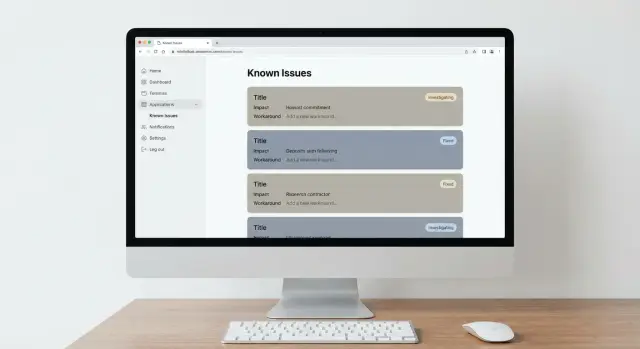
A solid known-issues page keeps each entry short and consistent. Most teams include:
- A plain-language title, plus who is affected
- The impact (what’s not working, what still works)
- A workaround users can follow in under a minute
- A status and “last updated” timestamp
- A quick way to confirm it matches their case (error text, screen name, or steps)
Notice what’s missing: speculation, blame, and long threads. Users don’t need your internal debate. They need clarity and a next step.
It’s also important to be clear about what this page is not. It’s not a postmortem, not a comment section, and not a replacement for your support inbox. It’s not a dumping ground for every minor glitch, and it’s not a promise board with exact fix dates you might miss. It’s also not a place to paste logs, stack traces, or anything sensitive.
Keeping the tone calm and factual matters. “We’re seeing an issue where some password reset emails arrive late” is helpful. “Our auth provider is failing because engineering changed X” invites arguments and confusion.
Why in-app matters: most users won’t find an external doc when they’re already stuck. They also won’t trust it if it looks outdated. The moment someone hits an error, they look for help inside the product: settings, help, notifications, or a small “Status” entry. If the known-issues page lives there, it becomes the fastest path from “something is broken” to “here’s what to do next.”
If your app was built quickly and now breaks in real usage (common with AI-built prototypes), an in-app known-issues page buys you time to fix things properly while keeping support load under control.
Where to put it in the app so users actually see it
A known-issues page only reduces tickets if people can find it in five seconds, right when they’re stuck. Don’t hide it in a footer or a deep help center category. Put it where users already go when something breaks.
The most reliable placements are:
- Help menu: the first place many people look
- Settings: good if you already keep “Support” or “About” there
- Status area: best when outages and degraded features are common
- Error screens: add a small “Known issues” entry when an error repeats
- Header or profile menu: useful if your app has no sidebar
Visibility matters as much as location. If the issue happens before login (password reset, signup, SSO), the page must be accessible to logged-out users or it will fail at the exact moment it’s needed. If it’s a billing or admin-only problem, keep it behind the right permissions so you don’t confuse regular users.
On mobile, assume people won’t hunt through nested menus. Keep the entry point one tap away from where they get stuck: a “Help” tab, a profile menu item, or a short entry on the error screen. If your mobile UI uses a bottom bar, “Help” often performs better than burying support inside Settings.
Set expectations on the page. A simple line like “Updated every weekday by Support” reduces “Is anyone looking at this?” messages. Internally, assign an owner so it doesn’t turn stale.
If you’re adding a known-issues page to a fast prototype that’s already getting support pings, make the entry obvious before you polish the design. A visible, regularly updated page beats a beautiful page nobody finds.
A simple issue template that answers the right questions
A known-issues page only reduces tickets if each item answers the same few questions, in the same order. When people are stressed, they skim. A consistent template helps them decide quickly: “Is this my problem, and what can I do right now?”
Use the user’s words first
Start with a title that sounds like what someone would type into a support chat, not an internal label. “Can’t log in with Google” beats “OAuth callback 500.” If your team needs an internal tag, add it at the end, but lead with plain language.
A simple issue card format that works well:
- Title (customer phrasing): one sentence, specific and searchable
- Who it affects + how to check: the group, plus “if you see X, it’s this issue”
- Impact (Low/Medium/High): what stops working and what still works
- Workaround (numbered steps): 3 to 6 steps a non-technical person can follow
- Status + timing (careful wording): where you are in the fix without promising a date
After the fields, add one short “what to expect” sentence. Example: “Your data is safe, but you may need to repeat step 2 each time you sign in.” That single line can prevent panic and follow-up tickets.
Status language that doesn’t trap you
Avoid exact deadlines unless you’re truly certain. Better options include “Investigating,” “Fix in progress,” “Fix rolling out,” and “Monitoring.” If you must talk about time, use ranges and conditions: “Next update by 3 PM” or “within a few days, if testing passes.”
If your app was built quickly with an AI tool and issues are piling up, this template also helps you triage. It turns vague complaints into clear, testable items. It’s the same kind of clarity teams aim for when they audit and repair AI-generated code.
Step-by-step: build the page and a publishing routine
Pick a place and format you can actually maintain. A dedicated page works best when issues pile up or you want search and filters. A small modal can work when you only have 1 to 3 active problems and want high visibility. A help panel section is a good fit if you already have a “Help” area and want this to feel like part of support, not a scary alert.
Start by standardizing the fields so every entry answers the same questions. Keep entries short so updates are fast.
Minimum fields most teams should include:
- Title: user-friendly, not internal ticket names
- Who is impacted: which users, plans, devices, regions
- What happens: one sentence in plain language
- Workaround: steps users can follow without guessing
- Status: investigating, fixing, monitoring, resolved
- Last updated: date and time, with timezone
Try to build the page with a simple data source so updates don’t require a full deploy. For many teams, a small admin screen or a protected CMS entry is enough. If your app is an AI-generated prototype that’s hard to change safely, it can be worth stabilizing the foundation first. Teams like FixMyMess often start with a quick audit, then add “support deflection” features like this without breaking other flows.
Create a lightweight publishing flow
A routine matters more than fancy UI. Use a simple three-step flow: draft, review, publish.
- Drafts can be written by support or product.
- Reviews should be done by someone who understands risk and wording (often engineering or a technical PM).
- Publishing should take minutes, not hours.
A cadence that stays realistic:
- Update on a set schedule (daily on weekdays, or within 2 hours for high-impact issues)
- Assign an owner per issue so updates don’t stall
- Pin the top 1 to 2 issues that cause the most tickets
- Include an expected next update time when the fix is still unclear
Add a clear “Still having trouble?” note under each workaround. Tell users exactly what to do next and what to include (for example: account email, device, screenshot, and the time it happened). Route them into your existing support flow, not a generic inbox.
Finally, set an end-of-life rule so the page stays trustworthy. Remove an issue when the fix has shipped and you’ve monitored it long enough to feel confident. If you keep a “Resolved” section, add a short note like “Fixed on Jan 12” and auto-expire resolved items after a set window (for example, 14 days).
How to write workarounds users can follow without help
A workaround is only useful if someone can complete it without opening a ticket. Your writing needs to behave like good UI copy: short, specific, and focused on the next action.
Treat each workaround like instructions for a stressed person. Skip the history, skip blame, and don’t over-explain. Users mostly want a path forward.
Write like a set of actions
Use clear action verbs and name what people will actually see on screen (buttons, fields, menu names). If you’re not sure what the UI label is, open the app and copy it exactly.
Rules that keep steps easy to follow:
- Start each step with an action: Click, Type, Refresh, Sign out, Try again.
- Keep each step to one action, and keep them in order.
- Include exact values when needed (for example, “Type your email address, not your username”).
- Warn about anything irreversible (for example, “This will delete drafts”).
- End with a success check so they know they’re done.
Screenshots can help, but only when they remove real confusion, like two similar buttons or a hidden menu. If a screenshot doesn’t clarify a choice, skip it. Also remember screenshots can reveal private data, so crop tightly and avoid user details.
Always state what success looks like
A workaround feels shaky if users don’t know whether it worked. Add one sentence like: “You should now see the Dashboard” or “The payment will show as Pending, then switch to Paid within 2 minutes.” This reduces repeat attempts and duplicate tickets.
A quick example for a login issue:
“Workaround: If the login button spins forever, refresh the page, then click Sign in with Email (not Google). Type your email, request a code, and paste the newest code from your inbox. Success: you land on the Home screen and your name appears in the top right.”
Include one safe fallback when it fails
Some users will still get stuck. Give one fallback that is safe, low-effort, and doesn’t risk data loss.
Good fallback options include using a private/incognito window, switching networks (Wi-Fi to mobile hotspot) and trying once more, signing out everywhere (if available) and signing back in, or contacting support with one specific detail you ask for (for example, the time of the attempt and the error text).
If the issue is caused by AI-generated code breaking in production, avoid risky suggestions like editing config files or sharing secrets. Keep the workaround inside the app whenever possible.
Security and privacy: what not to publish on a known-issues page
A known-issues page can reduce tickets fast, but it can also create risk if it shares the wrong details. The goal is to help real users finish their work, not to give attackers a map of your system.
Use a simple rule: publish user-safe guidance, keep internal investigation details private. If a workaround requires admin access, database queries, or touching production settings, it doesn’t belong on a user-facing page.
Keep these out of the page:
- Secrets or anything that looks like a secret (API keys, tokens, passwords, private keys)
- Internal endpoints, private IPs, server names, admin panels, or backdoor URLs
- Step-by-step debugging instructions (logs to collect, headers to copy, SQL queries to run)
- Detailed confirmation of a security weakness (exact injection point, bypass steps, affected tables)
- Personal data from real accounts, even as “examples” (emails, IDs, screenshots with user info)
Be careful with wording when the issue touches security. “We have a problem with authentication” is usually fine. “You can bypass login by doing X” is not. If you must acknowledge risk, keep it high level and focus on safe next actions: “We are investigating. As a precaution, reset your password if you reused it elsewhere.”
A practical example: if users report “Login fails for some accounts,” don’t publish the internal cause like “JWT secret rotation broke token validation on node-3.” Instead, share a safe workaround: “Try signing out fully, clear the app session, then sign in again. If you use SSO, use the email option temporarily.” Keep investigation notes in your internal ticket.
Coordination matters. Agree ahead of time what support can say publicly versus privately. A useful split is:
- Public: symptoms, impact, affected platforms, safe workaround, next update time
- Private (support-only): account lookup steps, logs to request, internal status, escalation notes
If you’re fixing an AI-generated app that has exposed secrets or risky patterns (a common find in FixMyMess audits), clean that up first. Then publish a short, user-safe note that avoids revealing how the weakness worked.
Example scenario: documenting a broken login without panic
A day after you ship a small change to your auth flow, support tickets jump: “I can’t log in.” Some users think their account is gone. Others try the same password five times and get locked out. While engineering works on the real fix, you need a calm, clear message inside the product.
Here’s what a single entry could look like on a known-issues page in-app. It stays neutral, explains who is affected, and gives people something they can try right now.
Sample issue entry (copy and adapt)
- Title: Login error after recent update
- Status: Investigating (workaround available)
- Symptoms: After entering correct email and password, users see “Something went wrong” and return to the login screen.
- Who is affected: Accounts created in the last 7 days (older accounts are not affected).
- Impact: High (blocks access)
- Workaround: Use “Forgot password” to reset your password, then log in again. If you signed up with Google, use “Continue with Google” instead of email/password.
- Last updated: 10:30 AM
- Next update: By 2:30 PM (or sooner if fixed)
After the entry, add one short paragraph that prevents repeat mistakes:
“If the workaround doesn’t help, stop trying multiple times. Wait 10 minutes and try once more. This avoids temporary lockouts.”
Status cadence that builds trust
Most people don’t need a long story. They need a predictable rhythm. Pick a check-in schedule you can keep, even if the update is “still investigating.” For a high-impact login bug:
- Update every 4 hours during business hours
- Update immediately when the workaround changes or the fix ships
- Close the issue only after you confirm it in production
If the login issue came from an AI-generated auth change that’s hard to untangle, say you’re validating the fix before rollout, not that you’re “stuck.” If you bring in a team like FixMyMess to repair the code, keep the entry focused on user steps and timing, not internal details.
Common mistakes that make the page useless (or risky)
A known-issues page only reduces tickets if people can understand it, trust it, and find it. Most failures come from good intentions paired with avoidable habits.
One fast way to lose users is writing like a developer. If the update says “OAuth redirect URI mismatch in NextAuth” or shows a stack trace, many people will stop reading and open a ticket anyway. Replace internals with plain outcomes: what’s broken, who it affects, what they can do right now.
Another trust-killer is overpromising dates. “Fix by EOD” sounds comforting until it slips twice. Use ranges and dependencies instead: “We’re working on it. Next update in 24 hours” or “Fix in testing, expected within 2 to 3 days.” If you share a target, update it when reality changes.
Stale pages are worse than no page. An outdated workaround that no longer works creates extra back-and-forth and makes every future message feel suspicious. If you can’t maintain it weekly, keep the list shorter and focus only on active, high-impact issues.
Too many issues with no structure also backfires. A long dump makes users scan for their problem, miss it, and file a ticket. Group by feature area (Login, Billing, Mobile), mark priority (High impact, Limited, Cosmetic), and keep only the items that drive support volume.
Finally, don’t hide the page. If it lives three menus deep, users won’t check it first. The best placement is close to where the pain happens: a small banner on the affected screen, plus a visible “Known issues” entry in Help or Settings.
Mistakes worth watching for day to day:
- Using jargon and error logs instead of plain steps a non-technical person can follow
- Publishing timelines you can’t meet, then going quiet
- Leaving resolved issues up, or leaving broken workarounds unedited
- Listing everything equally, with no grouping or “most common” section
- Burying the page so people never see it before contacting support
If your product was built from an AI-generated prototype, these problems can multiply because bugs change quickly. Teams like FixMyMess often start by turning a messy issue list into a clear, prioritized set of fixes, so what you publish stays accurate and safe.
Quick checklist and next steps to reduce tickets this week
If you want fewer “is this broken?” tickets, focus on two things: users must be able to find the known-issues page fast, and every issue must answer the same basic questions.
Quick checks (30 minutes)
Before you publish anything new, run these checks and fix what’s missing:
- Make the entry point obvious: “Help”, “Support”, or “Status / Known issues” in the main menu, plus a small banner when a high-impact issue is active.
- Use one template for every issue: what’s happening, who’s affected, workaround, status, and next update time.
- Keep it fresh: if the most recent update is older than 7 days, users will assume it’s abandoned.
- Write for action: the workaround should be 3 to 5 steps, with exact button names users see.
- Show confidence without overpromising: say what you know, what you don’t, and when you’ll update.
Operational checks (so it stays useful)
A known-issues page dies when nobody owns it. Set a routine that survives busy weeks:
- Assign an owner (one name) responsible for updates and cleanup.
- Add a quick review step (support lead or engineer) to prevent wrong guidance.
- Set an update schedule: daily for severe issues, weekly for minor ones.
- Define “done”: when an issue is fixed, move it to “Resolved” with the fix date and remove any risky workaround.
Once this is in place, help your support team deflect tickets consistently. Create a canned reply that points to the known-issues page and includes one sentence on what to do next (“Try the workaround above. If it still fails, reply with your account email and time of attempt.”). Keep it short so agents actually use it.
Next, decide what to build now versus what needs engineering time. If a workaround is confusing, make a small product change (better error message, retry button, or a temporary banner). If the issue is repeat breakage (auth loops, exposed secrets, messy logic), it usually needs a real fix, not better wording.
If your app started as an AI-generated prototype and it keeps breaking in production, FixMyMess (fixmymess.ai) can help you get it back into shape. They offer a free code audit to identify root causes, and many projects are fixed in 48 to 72 hours (or rebuilt quickly when the codebase can’t be saved).
FAQ
When should I add an in-app known-issues page?
Start using it as soon as you have a repeatable issue that multiple users can hit, even if the root cause isn’t fully understood yet. A simple entry that confirms the problem and offers a safe workaround can cut duplicate tickets within minutes.
Why does an in-app known-issues page work better than a status doc outside the app?
An in-app page is right where users get stuck, so it’s the fastest way to reduce “Is this broken?” messages. External pages are easy to miss, especially when users can’t log in or are already frustrated inside the product.
What information should each known-issue entry include?
Keep each issue short and consistent: what’s happening, who’s affected, what still works, a workaround they can do quickly, and when it was last updated. If users can’t tell in a few seconds whether it matches their problem, they’ll still contact support.
How do I share progress without promising a fix date I might miss?
Avoid exact promises unless you’re confident you can hit them. Use status language like “Investigating,” “Fix in progress,” or “Fix rolling out,” and add a clear “next update by” time so users know when to check back.
What should I never publish on a known-issues page?
Don’t include secrets, internal URLs, server details, logs, stack traces, or anything that explains how to exploit a weakness. Keep it user-safe: symptoms, impact, a safe workaround, and what users should do next if they’re still blocked.
Where should I place the known-issues page so users actually find it?
Put it where people look when something breaks: Help, Settings, a profile menu, or directly on common error screens. If the issue happens before login, make sure the page is accessible while logged out or it won’t help at the moment users need it most.
How do I write workarounds users can follow without opening a ticket?
Write steps a stressed, non-technical user can follow without guessing. Use the exact button and menu names from the UI, keep it short, and end with a sentence that explains what success looks like so users don’t retry repeatedly and create more tickets.
Who should own updates, and how often should we refresh the page?
Pick one owner and a simple routine: draft, quick review, publish. Update on a predictable cadence for high-impact issues and remove or archive resolved items so the page doesn’t go stale and lose trust.
Can a known-issues page reduce tickets even if we have lots of small bugs?
Yes, if it stays focused on active, high-impact problems that drive tickets. If you dump every minor glitch into it, users won’t scan it effectively and support will still get the same questions.
Will this page actually help if the product was shipped from an AI-generated prototype?
It helps immediately by reducing confusion and duplicate tickets, but it doesn’t replace fixing the underlying code. If your app was built from an AI-generated prototype and keeps breaking in production, FixMyMess can diagnose and repair the codebase, harden security, and prep for deployment, starting with a free code audit and often delivering fixes in 48–72 hours.