Mobile responsiveness for AI-built UIs: a layout audit
Mobile responsiveness for AI-built UIs: a practical layout audit to remove brittle CSS, stop overflow, and make pages usable on real phones and tablets.
What usually breaks on mobile (in plain terms)
When someone says a page is "not mobile friendly," they usually mean something simple: it loads, but it’s annoying or impossible to use on an actual phone.
You’ll recognize the symptoms:
- You can swipe sideways because something is wider than the screen
- Text gets cut off or overlaps
- Buttons and links are too small, too close together, or partly off-screen
- The layout jumps when images load or when you open the keyboard
- Menus, modals, or dropdowns appear in the wrong place and trap you
This happens a lot with AI-built prototypes because many tools make a UI that looks fine in a desktop preview, then hold it together with fragile CSS: fixed widths, absolute positioning, and pixel-perfect spacing. It also assumes one font size, one content length, and one viewport size. Phones break those assumptions fast.
A realistic example: an onboarding screen uses a two-column layout inside a fixed 900px container. On desktop it looks clean. On a phone, the right column pushes past the edge, creating horizontal scrolling. The "Continue" button ends up below the fold, and legal text overlaps an input because the keyboard shrinks the viewport.
If you want responsiveness, don’t redesign first. Audit first, then fix in order: find what forces the page wider than the screen, remove the CSS that locks elements in place, and only then tune spacing and tap targets.
Set up a quick, realistic test run
Test on real devices when you can. A resizable desktop window helps, but it can hide the annoyances real phones create: browser UI taking space, different font rendering, safe areas, and how your thumb actually reaches buttons.
Pick 3 to 5 screens that represent the whole app (not every page). A solid first batch is home/dashboard, sign-in, settings/profile, and one "money screen" like checkout, upgrade, or booking. Fixing these usually makes the rest easier.
Choose a few common sizes and stick to them so you can compare before and after. You’re not trying to cover every device, just the ones that reveal weak layout decisions:
- Small phone: 360 x 800
- Large phone: 390 x 844
- Plus-size phone: 414 x 896
- Tablet: 768 x 1024
- One in-between size from your analytics (if you have it)
Define what "good" means before touching CSS: no sideways scrolling, text readable without zoom, buttons easy to tap, and key flows completable with one hand.
A practical rule: if you can’t finish sign-in and the main action on a real phone in under a minute, the layout isn’t ready.
Find the sources of overflow and horizontal scrolling
Sideways scrolling almost always means one element is wider than the screen.
Reproduce the problem on a narrow viewport. If you can drag the page left and right even a little, something is overflowing.
One quick way to find the culprit is to temporarily outline everything, then scroll sideways and see what sticks out. When you spot the "mystery" card or button peeking past the edge, inspect its width, padding, and any child content that might be forcing it wider.
The same causes show up again and again: fixed widths (like a container set to 420px), large images or SVGs that won’t shrink, long unbroken strings (emails, IDs, keys) that can’t wrap, wide tables, and absolutely positioned elements that extend beyond the viewport.
Overflow often hides inside components that float above the page. Modals, dropdowns, and toasts may have their own containers with fixed widths, extra padding, or animations that push them off-screen. A modal can look centered on desktop but still create horizontal scroll on mobile because its inner content refuses to shrink.
A rule that saves time: prefer flexible sizing before adding more breakpoints. Before piling on more @media rules, remove the hard constraint that forces the layout wide.
Example: an onboarding screen has a "Verify code" modal. The modal is 480px wide, and the code input shows a long placeholder. On a 375px phone, the modal overflows. Changing the modal to use max-width: 90vw and letting the placeholder wrap removes the scroll without redesigning anything.
Remove brittle CSS that forces the layout to break
Most mobile failures in AI-generated frontends come from CSS that assumes one screen size. The fastest wins usually come from removing those assumptions.
Hunt for fixed widths and heights that "look fine" on desktop but can’t shrink. Common offenders are width: 1200px, min-width: 900px, height: 100vh on containers that should grow, and inputs/buttons with hard-coded sizes. If a card must be a certain width, it will push everything else into horizontal scroll.
Another common problem is wrapper-on-wrapper layouts. AI tools often stack containers that each add padding, max-width, and centering. Three wrappers with 24px padding each can steal a surprising amount of usable space on a small phone.
If you see patterns like absolute positioning for alignment, "magic numbers" like left: 37px, negative margins to nudge elements, or global rules like white-space: nowrap, treat them as suspect. Replace them with flexible rules that can breathe: max-width: 100% instead of fixed widths, height: auto where possible, and gap instead of manual margin stacks.
Example: an onboarding screen where the "Continue" button is absolutely positioned at the bottom of a card. On a small device, the keyboard opens and the button overlaps the form. Switching the card to a flex column and pushing the button with margin-top: auto keeps it in place without overlap.
Make layouts adapt with flexbox and grid
AI-generated UI code often only "works" because the sample content is the perfect length. On a real phone, text gets longer, buttons wrap, and the layout collapses into overlap or horizontal scrolling.
A simple rule helps: use flexbox for one-dimensional layout (a row or a column), and grid for two-dimensional layout (rows and columns that must align). Forcing everything into one tool usually makes the code fragile.
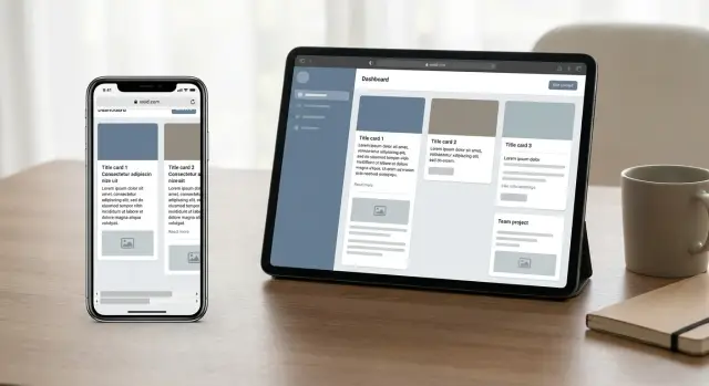
Use flexbox for nav bars, toolbars, button rows, and "icon + text + action" lines. Use grid for card galleries, settings pages with labels/values, and dashboards where columns must line up across rows.
Two CSS choices do most of the work on real content: allow wrapping, and allow text to shrink without breaking the row.
/* Card rows that wrap without odd gaps */
.cards {
  display: flex;
  flex-wrap: wrap;
  gap: 12px;
}
.card { flex: 1 1 260px; }

/* Grid that adapts to screen size */
.grid {
  display: grid;
  gap: 12px;
  grid-template-columns: repeat(auto-fit, minmax(220px, 1fr));
}

/* Mixed content row: icon + long title + button */
.row { display: flex; align-items: center; gap: 8px; }
.title { min-width: 0; flex: 1; }
.action { flex: 0 0 auto; }
Concrete example: an onboarding screen has a long plan name and a "Continue" button. If the title can’t shrink, it pushes the button off-screen. Setting min-width: 0 on the title and keeping the button flex: 0 0 auto prevents overflow without redesign.
Fix readability and tap targets without redesigning everything
Most mobile pain isn’t a complex layout problem. It’s text that’s too small, spacing that collapses, and controls that are hard to hit with a thumb.
Start with a few boring defaults that make every screen calmer: 16px body text with a 1.4 to 1.6 line height, headings scaled down so they don’t dominate, and consistent padding on page containers (often 16px) so content isn’t glued to the edges.
Tap targets are the next fastest win. Many AI-generated UIs output pretty buttons that are physically tiny on a phone. Aim for at least 44x44px for interactive targets, keep 8 to 12px between separate actions, and add padding to text links so they’re tappable. Also make sure focus styles stay visible instead of getting clipped.
Forms break more often than landing pages. Keep labels close to inputs, avoid two-column form rows on small screens unless they truly fit, and make inputs full width on mobile. Reserve space for error messages so the page doesn’t jump when validation appears.
Layout shifts often come from toasts, banners, and inline validation. If messages appear and disappear, try to keep the height consistent, or use an overlay area so content doesn’t jump around.
Example: an onboarding screen with "First name" and "Last name" side by side often squeezes both inputs into unusable widths. Switching to a single column, keeping labels above fields, and giving the Continue button a real tap size can make it feel finished without changing the design.
Tame tricky components: images, tables, and modals
A lot of mobile breakage comes from a few repeat offenders: images with fixed sizes, tables that assume desktop width, and modals that forget phones need scrolling.
Images that blow out containers
If an image has a hard width (like 800px) it can force the page wider than the phone.
Let images scale down but not up. In most cases, set a max width of 100% of the container and let height follow the aspect ratio. If a design needs a fixed-height hero, crop safely with object-fit so the image doesn’t stretch.
Long, unbroken text can cause the same sideways scroll. User IDs, emails, invite links, order numbers, and code blocks often refuse to wrap. Apply wrapping rules to content areas so long strings break lines instead of pushing the layout.
Tables without pain
Tables are hard on small screens. Pick one strategy per table based on what people actually need to do on mobile: scroll the table horizontally inside its own container, stack each row into a card-style layout, or show a short summary with a simple details view.
Write down which choice you used and why. Otherwise, a later edit can quietly reintroduce overflow.
Modals and drawers that stay usable
Modals often break because their height is fixed and the page behind them still scrolls. A safer pattern: limit modal height to the viewport, make the modal body scroll, and keep the header (title and close) visible.
Quick checks that catch most bugs:
- The close button is visible and easy to tap on small screens
- The modal content scrolls, but the background does not
- The keyboard doesn’t hide the primary action button
Example: a signup modal with a long terms paragraph should scroll inside the modal, not expand off-screen.
A step-by-step layout audit you can repeat on every page
Speed matters. The fastest path is to audit one screen at a time and fix the single thing that pushes the layout off the rails.
Pick one screen that clearly breaks on a phone. Write the symptoms like a bug report: "I have to scroll sideways," "the primary button is cut off," "the modal goes off-screen," "text overlaps the input." This keeps you from chasing random CSS changes.
Next, isolate the smallest element that triggers the break. In DevTools, toggle elements on and off until the problem disappears. It’s often one child with a fixed width, a long unbroken string, or a component that ignores its container.
A repeatable flow:
- Find the first element that exceeds the viewport width
- Remove fixed sizing (hard px widths, fixed left/right values) and let the parent control width
- Prefer fluid rules like
max-width: 100%andwidth: 100%where appropriate - Add wrapping for long content (names, emails, error text)
- Re-test on a real phone, then at one tablet width
Concrete example: an onboarding screen looks fine on desktop, but on iPhone the "Continue" button slips off-screen. You inspect the footer and find a container set to width: 480px. Deleting that one rule and letting the footer use width: 100% fixes the horizontal scroll and brings the button back.
Common traps that make the fixes fail later
The fastest mobile fixes often look fine at one screen size, then fall apart when real content shows up. A good rule: if you had to guess a pixel value, it’ll probably break later.
One common mistake is adding more breakpoints instead of fixing the core layout. Breakpoints are useful, but if the base layout depends on fixed widths or a desktop-first wrapper, you end up chasing new problems on every device. Start with flexible containers first, then add one or two breakpoints for big shifts.
Another trap is using overflow: hidden to make horizontal scrolling disappear. It can hide the symptom while cutting off buttons, error messages, or focus outlines. On forms, it can even hide validation text so users can’t finish the flow.
Hard-coded heights are also fragile. A card that looks perfect at height: 420px will clip when a name is longer, an error appears, or the user turns on larger text. Prefer natural content flow and let the page scroll.
Conflicting spacing rules can quietly undo your work. AI-built components often bring their own margins, paddings, and line-heights, and then global CSS adds more. When one component ships with different spacing assumptions, alignment drifts and overflow returns.
Don’t skip dark mode and high zoom testing. Quick checks that catch failures early: increase text size to 200% and re-check forms and modals, toggle dark mode and look for invisible borders and helper text, and test one small phone width and one large phone width.
Quick checklist for mobile usability
Use this after you fix overflow and brittle CSS. It catches the things that make a page feel broken on a real phone, even if it looks fine on desktop.
Make sure the page never forces sideways movement. Open your key screens (landing, sign-in, dashboard, settings) and try to swipe left and right. If anything moves, something is still wider than the viewport.
Then scan readability and interaction: paragraphs should wrap naturally, headings shouldn’t get cut off, you shouldn’t need to zoom to read labels or errors, and buttons shouldn’t feel cramped.
A simple set of checks:
- No horizontal scroll on key screens (including inside modals)
- Text wraps naturally (no clipped headings or fixed-width text blocks)
- Tap targets feel safe (buttons and links aren’t cramped)
- Forms stay usable (inputs, dropdowns, and error states stay on-screen)
- One-thumb flows work (menus and modals don’t require precision taps)
After any UI change, re-check just a few things: a 320px wide viewport still works, with the keyboard open you can reach the next field and the submit button, error states stay visible, loading states don’t stretch containers, and dark mode remains readable.
Example: if an AI-built settings page adds a new "Upgrade to Pro" pill, it can quietly trigger overflow. Catch it early by repeating the swipe test and the 320px check.
Example: rescuing a broken onboarding screen
A common case: the onboarding screen looks fine on desktop, but on an iPhone the card is cut off, the page scrolls sideways, and the "Continue" button sits under the keyboard.
In one rescue, three root causes created most of the damage. The main card had a fixed width (like 520px) and a hard left margin, so it couldn’t shrink. The email field allowed long addresses to push past the card because the input row couldn’t shrink cleanly. And a "Terms" modal used a fixed height with no internal scrolling, so it overflowed the viewport.
The audit starts by reproducing the issue at real device sizes, then finding the first element that sticks out. From there, walk up the parent chain until you find the container that refuses to shrink.
The fixes were small and focused on removing forced sizing. The card moved from fixed width to a max-width with fluid sizing, margins became responsive (centered with automatic side margins), the input row got rules that let it shrink without pushing siblings out, and the modal changed from fixed height to a viewport-based max height with internal scrolling.
Acceptance checks on phone and tablet were straightforward:
- No horizontal scrolling anywhere, even when focusing inputs
- The primary button stays visible above the keyboard
- The modal fits the screen and scrolls inside its own content
- Text stays readable without zoom, and tap targets feel easy
Next steps if your AI-built UI keeps breaking
If mobile issues keep coming back, the project usually lacks shared layout rules. A few decisions now prevent the next round of fixes from undoing the last.
Write a short "mobile rules" note and keep it near the code. Keep it specific:
- No fixed widths on page-level containers (prefer max-width and fluid sizing)
- Any component that can overflow must handle it on purpose (wrap, clamp, or scroll)
- One spacing system (a small set of gaps and font sizes)
- Buttons and inputs must stay usable with thumbs (comfortable height and clear labels)
Then fix in an order that creates stability: kill horizontal scrolling first, fix forms next (inputs, errors, keyboard behavior), and only then polish secondary screens.
If you inherited an AI-generated frontend and keep hitting the same layout failures, it can be faster to get a clean diagnosis of what’s actually forcing overflow and brittle positioning. FixMyMess (fixmymess.ai) focuses on repairing AI-built apps from tools like Lovable, Bolt, v0, Cursor, and Replit, and a quick codebase audit can tell you exactly what’s breaking on real devices before you sink more time into patching symptoms.