Next.js error boundaries with retry that users can recover from
Learn how to build Next.js error boundaries with retry that show a clear message, capture support context, and help users recover instead of hitting a blank screen.
Why blank screens lose users (and trust)
When an app crashes and shows a blank screen, most people assume they did something wrong. They click back, refresh, or close the tab, and they usually don't come back.
The real damage isn't the error itself. It's the uncertainty: "Did my work save?", "Is my account broken?", "Is this safe to use?" A silent failure teaches users to stop trusting every button.
Blank screens also hide what matters most in the moment: the next step. If checkout dies, the user needs a way to try again. If a form submission fails, they need to know whether it went through and how to avoid retyping everything.
Recovery matters more than perfect wording because people are trying to finish a task, not read an explanation. A good error experience keeps the app usable when possible. When it isn't possible, it guides the user to the next best action.
A practical goal for fallback UI:
- Tell the user what happened in plain language
- Offer one clear action (Retry, Reload, Go back)
- Protect their work (keep form state if you can)
- Provide a way to get help (with a reference code)
That is why error boundaries with a Retry action are so effective: they turn a dead end into a detour. Even a basic "Try again" button can save a session when the crash was a temporary network problem or a flaky API.
Sometimes showing a helpful error screen is better than hiding failures. If your app breaks in production, pretending it's fine just wastes user time. A clear recovery screen turns vague reports like "it stopped working" into something actionable.
What React and Next.js error boundaries actually do
An error boundary is a safety net for your UI. When a component crashes while rendering (or in a lifecycle method), the boundary can catch that crash and show a fallback screen instead of taking down the whole page.
In plain terms, it catches problems that happen while React is trying to draw the screen. It does not catch errors in event handlers (like a button click), errors in async code that runs later (like a fetch promise), or issues outside React (like a browser extension breaking things). Those need their own handling.
In Next.js, it also helps to separate client and server failures.
Client errors are crashes in code running in the user's browser (a broken component, bad state, unexpected data shape). Server errors happen while Next.js is building the page on the server (a database query fails, an API times out, auth checks throw).
A good fallback UI should help a real person take the next step:
- Say what happened in simple words (no stack traces)
- Offer an action like Retry or Reload
- Keep the rest of the page usable when possible
- Provide a small support code so someone can help
The biggest win is reducing the blast radius. Instead of one bad widget breaking checkout, only that widget fails while the cart, navigation, and form inputs stay alive.
The recovery-first pattern: message + action + context
A good error boundary isn't just a crash catcher. It's a recovery screen that helps someone finish what they came to do. The goal is to reduce panic, offer a safe next step, and capture enough detail to fix the root cause.
A recovery-first fallback has three ingredients: a clear message, a safe action the user can take right now, and a small piece of context they can share with support (like a reference ID).
Start with the action, not the apology. If a section of the page fails, let the user retry just that section. If the whole route failed, offer Reload page or Go back. Keep actions low-risk: they shouldn't delete data or accidentally repeat a purchase.
For the message, say what the user needs to know, not what the code knows. Avoid stack traces, component names, or "TypeError: undefined is not a function". A better message is: "We couldn't load your projects. Your changes are saved. Try again."
Then add context that turns a vague bug report into something you can debug. Show a short reference ID such as ERR-7F3A2C and a timestamp. If you log that same ID, support can find the matching error quickly.
Plan your boundaries before writing code
Error boundaries work best when you treat them like part of the product design, not a last-minute patch. Before you add components, decide what "recovery" means for each part of the app.
Start by mapping where failures should be contained. A page-level boundary is useful when the whole route depends on one request or one critical layout. Smaller, component-level boundaries work better when you can keep the rest of the page usable (for example, the sidebar loads but the activity feed fails).
A quick placement rule:
- Put a boundary at the page or route level for critical flows like checkout, sign-in, or saving settings.
- Put a boundary around optional widgets like recommendations, charts, or comments.
- Add a boundary around risky integrations like third-party SDKs, embedded editors, and file uploads.
- Avoid wrapping every tiny component. It makes errors harder to understand.
Next, define what Retry actually does. Retry should be predictable: re-render the segment, refetch data, or reset a specific slice of state. If Retry just replays the same broken state, users will spam the button and get stuck.
Make the behavior explicit with a simple rule: "Retry resets X and refetches Y." For example, if "Save profile" fails, retry should re-run the save request and re-enable the form, not wipe what the user typed.
Finally, decide what context you'll capture for support, and what you'll never show. Helpful context can be as simple as route/screen name, what the user clicked, timestamp and environment (prod vs staging), and a short error code. Keep strict red lines: never include secrets, tokens, full request bodies, or personal data in the UI.
Step-by-step: add error boundaries with Retry in Next.js
A good error boundary does two things: it tells the user what happened in plain words, and it gives them a clear next step (Retry or go back). Here are two practical ways to add that.
App Router: error.tsx + reset()
In the App Router, add an error.tsx file inside the route segment you want to protect. Next.js will render it when something in that segment throws.
'use client'

export default function Error({
  error,
  reset,
}: {
  error: Error & { digest?: string }
  reset: () => void
}) {
  return (
    \u003cdiv style={{ padding: 16 }}\u003e
      \u003ch2\u003eSomething went wrong\u003c/h2\u003e
      \u003cp\u003eTry again. If it keeps happening, you can go back to a stable page.\u003c/p\u003e

      \u003cdiv style={{ display: 'flex', gap: 8, marginTop: 12 }}\u003e
        \u003cbutton onClick={() => reset()}\u003eRetry\u003c/button\u003e
        \u003cbutton onClick={() => (window.location.href = '/')}\u003eGo to Home\u003c/button\u003e
      \u003c/div\u003e

      \u003cp style={{ marginTop: 12, fontSize: 12, opacity: 0.8 }}\u003e
        Error code: {error.digest ?? 'unknown'}
      \u003c/p\u003e
    \u003c/div\u003e
  )
}
Use user-friendly labels. "Retry" is clearer than "Reset boundary", and "Go to Home" is safer than leaving someone stuck.
Pages Router: reusable ErrorBoundary component
If you're on the Pages Router (or you want a wrapper you can place around a specific widget), use a React class component.
import React from 'react'

type Props = { children: React.ReactNode; fallback?: React.ReactNode }

type State = { hasError: boolean }

export class ErrorBoundary extends React.Component<Props, State> {
  state: State = { hasError: false }

  static getDerivedStateFromError() {
    return { hasError: true }
  }

  retry = () => this.setState({ hasError: false })

  render() {
    if (this.state.hasError) {
      return (
        this.props.fallback ?? (
          \u003cdiv style={{ padding: 16 }}\u003e
            \u003ch2\u003eWe hit a problem\u003c/h2\u003e
            \u003cp\u003eYou can retry, or go back to a stable page.\u003c/p\u003e
            \u003cbutton onClick={this.retry}\u003eRetry\u003c/button\u003e{' '}
            \u003cbutton onClick={() => (window.location.href = '/')}\u003eGo to Home\u003c/button\u003e
          \u003c/div\u003e
        )
      )
    }

    return this.props.children
  }
}
Place this boundary around the smallest risky area (a complex form, payment widget, or data-heavy panel) so the rest of the page stays usable.
Add support context without exposing sensitive data
When something fails, users don't want a mystery. Give them a simple reference they can share, and capture enough context to help you reproduce the issue.
Start by generating an error ID (a short random string or UUID). Show it in the fallback UI as "Error ID: ABC123" and make it easy to copy. If the user hits Retry, keep the same ID so you can connect the first failure to the retry attempt in your logs.
Capture lightweight context that answers: where were they, what were they trying to do, and when did it happen? Usually you only need a few fields:
- Route or page (for example, /settings/billing)
- Feature area (Billing, Checkout, Editor)
- Last user action (Clicked "Save", Submitted form)
- Timestamp and timezone
- App build/version
Send or store the detailed error safely. A good rule: if you wouldn't paste it into a public chat, don't collect it automatically. Avoid secrets (API keys, tokens), full request bodies, passwords, payment details, and raw cookies. If you log server-side, prefer redaction and allowlists (only log the fields you expect).
If you add a "Report this" or "Contact support" option in the error UI, pre-fill the error ID and basic context so the user doesn't have to explain everything.
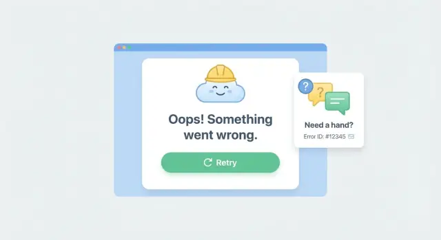
Designing the fallback UI users can actually use
A good error screen should feel like a safe landing, not a dead end. Skip technical terms and avoid blaming the user. "Something went wrong" is fine. "Unexpected token in JSON" is noise.
Keep the page structure familiar so it still feels like your app. Preserve the header, navigation, and the space where content normally appears. When the layout stays steady, people are more likely to try again instead of leaving.
Make the next step obvious. The primary button should be the visual center of the screen, not a tiny text link. Put the primary action first, and name it in plain language.
A simple set of actions that covers most cases:
- Retry
- Go back
- Refresh page
- Contact support
Add one short sentence that tells them what happens if they retry (for example, "We'll try loading your data again"). If there's a chance of lost changes, say that clearly and offer a safer option like "Copy details" or "Save draft" if you have it.
Accessibility matters here. When the fallback appears, move keyboard focus to the heading or primary button so screen reader and keyboard users know something changed. Ensure readable contrast, large tap targets, and that Enter and Space activate the main button.
Finally, include small, non-sensitive context that helps support without scaring users: a timestamp, a short reference code, and what they were trying to do ("Saving settings").
Common mistakes (and how to avoid them)
Error boundaries are meant to protect users, not hide problems. A friendly screen doesn't help if the same bug keeps happening. It just moves the pain from the UI to support.
The biggest mistakes are usually simple.
Mistakes that quietly make things worse
- Catching too much: A single app-wide boundary can turn a small "profile widget failed" into a full page failure. Put boundaries around features so the rest of the page still works.
- Retry with no exit: If Retry keeps failing, users feel trapped. After 1-2 retries, offer a different path (go back, refresh, or contact support).
- Showing raw error text: Stack traces and database messages scare users and can leak details. Show a simple message and keep technical info in logs.
- No error ID: If support can't match what the user saw to what you logged, triage becomes guesswork.
- One-size-fits-all fallback: "Something went wrong" everywhere trains users to abandon the app. Tailor the fallback to the feature: saving, loading, auth, payments.
How to avoid them (simple rules)
Treat retry as a recovery tool, not a reset button. Disable the Retry button while the retry is running, and change the message if it fails again.
Include support context that helps debug without exposing secrets: error ID, time, page or feature name, and the last action. Keep tokens, emails, and full payloads out of the UI.
Test the failure path on purpose. Turn off your network, force a 500 response, and confirm the UI gives users a clear next step and gives support something traceable.
Quick checklist before you ship
Before you ship error boundaries with retry, do one pass focused on real user recovery. You want to prove two things: the fallback appears when it should, and the user has a clear way back to what they were doing.
Trigger a controlled error on purpose (for example, throw inside a component that normally loads data). Then check:
- The fallback renders with a clear message (no stack traces).
- Retry either recovers fully or fails again with a calm, consistent UI.
- An error ID is shown to the user and appears in logs.
- The UI and logs don't include secrets or personal data (tokens, emails, full queries, request headers).
- The flow works on a phone and on a slow connection. Buttons should be easy to hit, and Retry should not spam requests.
Make sure Retry resets any stuck loading state, disables itself while running, and shows a short status like "Retrying...". If Retry can't work (offline, missing permissions), say so and offer a safe next action.
A realistic example: "Save failed" without losing the user
A user edits their billing address and clicks Save. The request hits a flaky backend, returns a 500, and one part of the UI throws an error. Without a boundary, the page can crash into a blank screen. The user is stuck, unsure if their changes were saved, and likely to abandon the flow.
With a recovery-first setup, the error boundary catches the crash and shows a fallback that keeps the user oriented. The form stays on screen if possible (or it re-renders with the last typed values), and the message is plain: "We couldn't save your changes." It offers an obvious next step: Retry. If Retry fails again, the user still has a safe exit like "Go back to dashboard" or "Cancel changes".
What makes this usable is the extra context that travels with the error, without exposing sensitive data:
- The user sees a short message, a Retry button, and a clear way to leave the page.
- The user sees an error ID they can copy (example: FM-8K2Q) when contacting support.
- Support sees the error ID plus basic context: route, timestamp, app version, browser, and the last action.
- Support can reproduce faster because they know which request failed and what state the UI was in, without needing the user to explain it.
Next steps: roll it out safely and get help if it's messy
Treat error boundaries like any other user-facing feature: ship them in small steps, watch what happens, then expand.
Start with one fragile flow where a crash hurts the most, like checkout, login, or Save. Add a boundary, make sure the fallback explains what happened in plain words, and confirm Retry actually does something useful (not just re-triggering the same crash).
Before you spread boundaries everywhere, decide ownership. Someone needs to review the error copy, the actions (Retry, Go back, Contact support), and the support context so it stays helpful and safe.
If you're implementing this in a codebase generated by AI tools, expect surprises: tangled state, fragile save flows, broken auth, exposed secrets, or unsafe queries that make "Retry" impossible. If you need a fast diagnosis and a practical fix plan, FixMyMess (fixmymess.ai) focuses on turning broken AI-generated prototypes into production-ready software, including codebase diagnosis, logic repair, security hardening, and deployment preparation.
FAQ
Why do blank screens make users leave so quickly?
A blank screen creates uncertainty. Users don’t know if their work saved, if their account is broken, or what to do next, so they leave.
A simple fallback that explains what happened and offers a safe next step keeps people moving instead of abandoning the task.
What problems do React error boundaries catch (and not catch)?
An error boundary catches render-time crashes in React components and shows a fallback UI instead of crashing the whole page.
It won’t catch errors from event handlers (like a click), async promise rejections that happen later, or issues outside React, so you still need normal try/catch and request error handling.
When should I use `error.tsx` vs a reusable ErrorBoundary component?
Use error.tsx in the App Router when you want Next.js to automatically render a recovery UI for a route segment when something throws.
Use a reusable ErrorBoundary component when you want to protect a specific widget or part of a page so the rest of the UI stays usable.
What should a good fallback UI say and do?
A practical default is: a plain message, one primary action (usually Retry), and a way out (Go back or Home).
If you can, add reassurance about state such as “Your changes are saved” or “You may need to retry,” but only say it when you’re sure.
What should the Retry button actually do?
Retry should reset the broken part of the UI and re-run the exact thing that failed, like refetching data or reattempting a save.
If Retry just re-renders the same bad state, users will get stuck, so make Retry change something meaningful (reset a slice of state, clear a cache, or re-request data).
How do I avoid trapping users in an endless Retry loop?
After one or two failed retries, switch the UI from “Try again” to offering an exit like Go back, Reload page, or Contact support.
This prevents users from button-spamming and gives them a clear way to continue their work somewhere stable.
What support context should I show users when something crashes?
Show a short reference like an Error ID plus a timestamp, and log the same ID on your side.
Keep it lightweight and non-sensitive so users can safely copy it into a support message without exposing private data.
What data should never appear in the error screen?
Don’t show stack traces, tokens, cookies, full request bodies, payment details, or anything you wouldn’t want pasted into a public chat.
A safe rule is to display only a short error code and basic context like “Saving settings,” while keeping technical details in protected logs with redaction.
Where should I place error boundaries in a Next.js app?
Place boundaries around the smallest risky areas so one failing widget doesn’t take down checkout or a full page.
Use page or route boundaries for critical flows like sign-in and payment, and component boundaries for optional panels like charts, comments, or third-party embeds.
How can I test error boundaries before shipping?
Force failures on purpose: throw inside a component, simulate a 500 response, and try offline mode to see what the user experiences.
Confirm the fallback appears, Retry doesn’t spam requests, and the error ID matches what you log, without leaking secrets.