Prevent UI changes from breaking business logic in AI apps
Learn how to prevent UI changes from breaking business logic by separating styling from behavior, using safe steps, quick checks, and realistic examples.
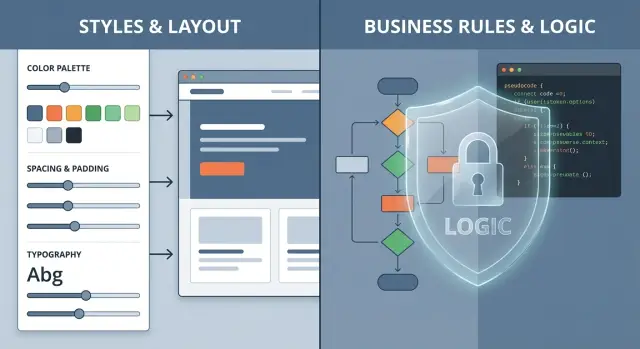
Why UI edits break business logic in AI-made apps
A UI change feels harmless: move a button, rename a label, adjust spacing. But in many AI-made prototypes, the same file that controls the look also controls what happens when you click, what data gets saved, and which rules apply. That’s why a “visual tweak” can change real behavior.
A common cause is mixed responsibilities. One component might handle layout, compute a shopping cart total, call a payment API, and decide whether a user is allowed to do something. When you adjust the layout, you may accidentally touch the logic by moving code around, changing props, or changing when something rerenders.
Another cause is hidden coupling: a CSS class name is also used as a selector in JavaScript, a button’s text is used as a key, or a “simple cleanup” changes the order of event handlers. AI tools also tend to generate fragile patterns like inline calculations inside UI handlers, duplicated validation rules, and state that resets whenever a component rerenders.
Symptoms usually show up fast:
- Buttons stop responding or trigger the wrong action.
- Totals, taxes, or discounts change after a layout tweak.
- Login works once, then gets stuck in a redirect loop.
- A form submits, but the saved data is missing fields.
- A modal opens, but the app state never updates.
A safe UI change means you can adjust how something looks without changing what the app does: same inputs, same outputs, same rules, same side effects.
Example: you replace a “Pay now” button with a new component to match the design system. The new button looks right, but it no longer forwards the onClick handler, so the payment call never happens. Nothing in the UI screams “billing broke,” but the business logic is now disconnected.
This is one of the most common patterns teams find in AI-generated code: the app works until a “visual” tweak touches the logic sitting right next to it.
Design vs behavior: draw a clear line
Most breakages happen because design and rules are mixed in the same file.
Design changes affect layout, spacing, colors, typography, icons, and copy. They change what people see.
Behavior changes affect decisions: validation rules, pricing math, permissions, what gets saved, when an API call runs, and what happens when something fails.
A simple rule keeps you safer: UI should display state, not decide rules. A component can show an error message, but it shouldn’t invent the error condition. It can render “$29/month,” but it shouldn’t calculate that price inside a click handler full of hidden conditions.
Where UI files become risky
In AI-generated prototypes, the most dangerous logic often hides in places that look like “just UI,” especially:
- Event handlers (
onClick,onSubmit,onChange) that contain business rules. - Shared state that mixes UI state (modal open) with domain state (user role, plan).
- API calls made directly inside UI components.
- “Helper” functions defined in a UI file and reused across screens.
These areas are easy to change by accident when you’re rearranging layout or renaming props.
What can stay in the UI, and what should move out
It’s fine for UI code to handle presentation details: loading spinners, disabling a button while saving, formatting dates and currency, and choosing which view to show for a given state.
Move anything that decides outcomes into one shared place outside the UI: validation, pricing and billing rules, permission checks, mapping API errors to user-friendly messages, and any “if this, then that” decisions that affect real data.
A quick test: if changing a color, label, or layout could change the result, that code doesn’t belong in the UI.
A safer workflow before you touch the UI
Treat every visual tweak like a tiny release. In fragile prototypes, the risk isn’t the CSS - it’s the accidental side effects.
Start with one small change. Before opening the editor, write a short “must stay true” list: the outcomes that cannot change after the UI update. Keep it concrete and human-readable.
If you’re adjusting a checkout page, your “must stay true” list might be:
- The total stays the same.
- The coupon still applies.
- The pay button charges exactly once.
Next, create a snapshot you can roll back fast. If you use version control, make a new branch. If you don’t, duplicate the project folder and label it with the date and change name.
Then work in small steps: edit, run, check, save a checkpoint, repeat. Avoid “while I’m here” extras.
Finally, decide how you’ll verify success before you start. Pick one short flow you can repeat every time, like: “log in, open settings, change email, save, refresh, confirm it stuck.” If you can’t describe the flow in one sentence, the change is probably too big.
Step by step: make a UI-only change without changing behavior
When you want a UI-only edit, keep the wiring stable.
- Name the exact screen and the single action you’re affecting (for example, “Settings screen, Save button”).
- Find the logic behind it (validation, calculations, request payload). Mark it as off-limits for this UI change.
- Apply the visual change only (spacing, layout, copy). Keep handlers, props, and data paths the same.
- Re-run the same user flow with the same inputs and compare results.
- If you want to do cleanup (renaming, refactoring), do it as a separate change after the UI edit is proven safe.
A common failure looks like this: you move a “Save” button into a sticky footer. The safe part is layout. The risky part is re-wiring onClick to a new function “because it looks cleaner.” That’s how “Save” suddenly stops sending a required field.
Move rules out of the UI and into one shared place
Many “UI bugs” in AI-made apps aren’t visual. The screen is quietly doing math, deciding eligibility, or shaping what gets sent to the server. Then a design tweak changes a prop name or component structure and the rules change by accident.
A safer pattern is simple: keep rules in a shared place and let the UI focus on display and input.
Put rules where you can find them
If pricing, discounts, permissions, or validation exist in three different screens, you’ll get three different answers. Instead, create a single module that owns the rules and call it from anywhere.
For example:
PricingRulesdecides totals and eligibility.PricingCardonly shows results.
Keep it readable:
- One module per domain (pricing, billing, auth).
- Prefer pure functions when possible (same input, same output).
- UI components receive final values as inputs.
- Server calls happen in a predictable place, not inside random buttons.
Keep UI components “dumb” on purpose
A component that fetches data, calculates totals, and renders the page is hard to edit safely. When everything is mixed together, a layout change can trigger a refetch, change a default, or skip a check.
Aim for this flow: fetch data -> compute rules -> render UI.
Here’s a common scenario: a pricing page calculates tax inside a card component based on local UI state. Later, someone swaps a checkbox for a toggle and changes the default to “on” because it looks nicer in demos. Now real users get charged tax when they shouldn’t. If tax calculation lived in PricingRules and the UI only passed isTaxable in, that visual change wouldn’t quietly rewrite billing.
Protect critical flows with quick, repeatable checks
If you only test “does the page look right?”, you’ll miss failures that hurt customers: sign-ins that silently fail, forms that stop saving, or prices that calculate wrong. You don’t need fancy automation to catch most of these. You need a short set of checks you actually run.
Pick a few flows that truly matter and keep the list short:
- Login and session (sign in, sign out, stay signed in).
- Checkout or payment (totals, discounts, confirmation).
- Save and load (create, edit, refresh, data still there).
- Permissions (who can view, edit, delete).
For each flow, write expectations in plain language and reuse the same sample inputs every time (one test user, one bad password, one cart with known items, one coupon). Stable inputs make behavior changes obvious.
A realistic example: you “clean up” a login form by renaming an input or moving it into a new component. The UI looks better, but the app stops sending the email field correctly, or submit fires twice. If your check says, “With [email protected] and password WrongPass, show ‘Invalid credentials’ and do not log in,” you catch it immediately.
Common traps that make “small” UI changes risky
Trap 1: Moving a button and accidentally changing the handler
When repositioning a button, it’s easy to reattach the wrong handler, change arguments, or move logic between parent and child components.
Watch for warning signs:
- The click now calls a different function name.
- The handler moved and now runs at a different time.
- A new inline function changes the arguments.
- A disabled state got removed just to “make it look right.”
Trap 2: Renaming fields, IDs, or keys that other logic depends on
UI code often relies on magic strings that other parts of the app silently depend on: email, planId, billingAddress, user_id. Renaming one for readability can break form submission or API mapping.
Example: you rename billingEmail to email to match the design. The UI looks fine, but the API expects billingEmail, so the request goes out missing data and billing fails.
Trap 3: Pulling API calls into UI during a layout refactor
During a reorg, it’s tempting to move “just one fetch” into a UI file for convenience. Soon the component holds layout code, state rules, and network calls. Then a UI-only edit changes when requests run or what happens on errors.
A red flag: your layout change includes touching fetch, token logic, or request payload building.
Trap 4: Copying UI from another screen and overwriting rules
Copy-paste often drags in validation defaults and edge-case handling you didn’t mean to change. Before you paste, check whether you’re also importing submit logic, validation schemas, or hidden defaults.
Trap 5: Hiding a visual bug by disabling error states
Removing error messages, red borders, or loading states can make a screen look “cleaner,” but it also hides real failures and can let bad data pass through. If an error message is annoying, treat it as a clue and fix the cause instead of turning the warning light off.
Example: a pricing page tweak that breaks billing
A common real-world bug: you redesign pricing cards and suddenly checkout totals are wrong. Nothing looks “broken,” but customers see the wrong amount or get charged incorrectly.
Typical scenario: the old pricing card showed “$29/mo” and “3 seats included.” During a redesign, the card adds a Monthly/Annual toggle. The UI code also “helpfully” updates variables so it can display the annual discount.
Visually, it’s small: new toggle, new spacing. What changed is the math. The card starts calculating price * 12 * 0.8 and passes that number forward as the plan price. Checkout already has its own pricing rules, but now it receives a number that’s already discounted and multiplies again. Totals go off, taxes can be wrong, and receipts don’t match what the user saw.
To prevent this, separate the pricing display from the pricing rules:
- Make the UI read-only for price: show values, don’t compute them.
- Keep a single source of truth for pricing inputs (plan id, interval, seats).
- Pass plan IDs to checkout, not raw numbers.
- If the UI must compute anything, limit it to formatting (currency and display text).
If it’s already broken, recover fast: revert the change that touched calculations (even if the UI looks worse temporarily), isolate pricing logic into a shared module used by both checkout and any estimate display, then re-apply the redesign using safe inputs and formatted outputs.
Next steps if your AI-made prototype keeps breaking
If every “small” UI change creates a new bug, the UI and business logic are probably tangled together. You may also see side effects like a button style tweak changing what gets saved, auth failures after layout edits, or fixes that only work on one machine.
Signs you likely need a deeper cleanup:
- UI components contain rules (pricing, permissions, validation) instead of calling shared logic.
- Changing text or layout breaks API calls, state, or saving.
- Secrets or keys show up in the frontend, or auth breaks often.
- No one can explain where totals, roles, or billing rules are defined.
- Each fix creates new bugs elsewhere.
A focused remediation doesn’t have to mean a full rewrite. Often it’s a controlled reset of the foundation: diagnose the codebase, pull key rules out of UI components, refactor the messy parts into clear modules, harden obvious security issues (like exposed secrets and common injection risks), and prep the app so deployments behave consistently.
If you inherited an AI-generated app from tools like Lovable, Bolt, v0, Cursor, or Replit and it keeps failing in production, FixMyMess (fixmymess.ai) specializes in turning fragile prototypes into production-ready software. A free code audit can help you see which UI files are carrying hidden billing, auth, or data rules before you touch another “simple” design tweak.
FAQ
Why does a small UI tweak break business logic in AI-generated apps?
Because the UI and the rules often live in the same component. When you change layout or swap a component, you can unintentionally change props, event handlers, rerender timing, or state defaults, and that changes what the app does, not just what it looks like.
How can I tell if a file is “just UI” or secretly contains business rules?
If a component calculates totals, validates inputs, checks permissions, or builds an API payload inside onClick/onSubmit, it’s not “just UI.” A quick check is: if changing copy, spacing, or component structure could change the result saved or charged, the logic is too close to the UI.
What is “hidden coupling,” and why is it so common in AI-made code?
Coupling is when something that looks like presentation becomes a dependency for behavior. Common examples are class names used as JavaScript selectors, button text used as a key, or “magic” field names that the API mapping depends on. Rename or reorder the “harmless” piece, and behavior changes quietly.
Why does swapping a button component sometimes stop payments or saves from working?
Most often, it’s because the new component doesn’t forward the original wiring. The handler might not be passed through, the button might render as a different element type, or a disabled/loading state got removed. Visually it’s correct, but the click path is disconnected.
What’s the safest way to do a UI-only change without changing behavior?
First write a short “must stay true” checklist for the flow you’re touching, like what should be saved, charged, or shown. Then make the smallest possible change, keep handlers and data paths identical, and re-run the same inputs end-to-end to confirm outputs didn’t change.
Should I refactor while I’m doing a design tweak?
Freeze the logic boundary before you start. Mark the validation, calculations, and request payload as off-limits, and only touch layout, spacing, copy, and styling. If you want to refactor or rename things, do it as a separate change after the UI-only change is proven safe.
What logic should be moved out of UI components first?
Move anything that decides outcomes into a shared place outside the UI. Pricing math, permissions, validation rules, and API payload shaping should live in one module or service so the UI only displays final values and collects inputs. This reduces the chance that a layout edit changes real decisions.
How do I test quickly so I catch logic breaks after UI changes?
Pick a few critical flows and run them the same way every time with the same test inputs. Focus on login/session, saving and reloading data, and checkout totals if you have payments. If a check can’t be described in one sentence, it’s too big to be reliable.
Why do rerenders and shared state cause weird bugs after layout changes?
UI state like “modal open” or “active tab” gets mixed with domain state like “user role” or “selected plan,” and rerenders reset or overwrite it. The result is redirect loops, missing fields, duplicated submits, or calculations that change when the UI updates.
When should I stop tweaking and get help remediating an AI-generated app?
If every visual tweak causes new failures, you likely have tangled UI and business logic, duplicated rules across screens, and fragile patterns that break under small edits. FixMyMess can run a free code audit, identify where billing/auth/data rules are hiding in UI files, and remediate the codebase so UI changes stop breaking production behavior.