Reduce support tickets with better forms and error messages
Use clear labels, smart validation, and friendly error text to reduce support tickets with better forms and fewer user mistakes.
Why forms generate so many support tickets
Most form tickets aren’t real bugs. They’re small misunderstandings that stop people at the worst moment: when they’re trying to sign up, pay, or ask for help.
A form asks someone to translate what they mean into what the system accepts. People don’t think in valid formats. They think in real life. Someone types “tomorrow morning” into a date field, “+44 (0)…” into a phone box, or pastes a full address into a Street input because that’s what they have.
Confusion usually starts with tiny details: unclear labels, hidden rules, and surprise requirements. If the form doesn’t explain what it wants, users guess. When they guess wrong, they hit an error, feel stuck, and open a ticket.
Common places where those guesses happen include labels that don’t match what the business means, required fields that look optional (or the other way around), format rules that only appear after failure, inputs that reject normal typing (spaces in card numbers, dashes in phone numbers), and messages that say “invalid” without telling the user what to do next.
You’ll see this in everyday flows. In sign-up, people may not know whether to use an email or a username, or why a password was rejected. In checkout, a billing address mismatch or a postal code rule can block payment. In contact forms, people may paste long messages into a short field, or miss a required topic dropdown they didn’t notice.
The goal is straightforward: make the rules obvious before someone trips over them, and make it easy to recover when they do.
Find the top mistakes your users keep making
Support tickets already tell you where people get stuck. The fastest way to cut form-related tickets is to stop guessing and use real user questions as your roadmap.
Pull your most recent tickets that mention a form, checkout, signup, password reset, or billing update. Twenty is usually enough to see patterns without getting overwhelmed. Keep the exact phrases people use, even if they’re messy. Those words are clues.
Then group each ticket by where the user got stuck using the same structure as your form: the step, the field, and what happened. You’re looking for repeat patterns like:
- “I keep getting an error” (no idea why)
- “What does this mean?” (label confusion)
- “It won’t accept my card” (validation rules that are too strict or unclear)
If you want a quick sorting template, track four things: the step (Signup, Address, Payment), the field (Phone, Postal code, Card number), the user’s wording (the sentence they wrote), and the outcome (blocked vs slowed down).
Pick only 3 to 5 fixes to start. Prioritize the problems that block completion and show up the most. If half your tickets mention “postal code invalid,” that’s often one confusing rule or missing hint, not a user problem.
If your form was generated quickly by an AI tool and later patched, the same bug can exist in multiple places. In that case, it’s worth doing a short codebase diagnosis before you rewrite messages, so you don’t polish the copy while the logic stays broken.
Write labels and helper text that prevent confusion
Most form mistakes aren’t user errors. They’re label errors. If someone has to guess what a field means, they’ll guess wrong, submit it, and contact support when something breaks.
Use everyday words, not internal terms. “Billing contact” might make sense to your team, but most users just want to know who gets the receipt.
Put the most important word first. People scan forms quickly, especially on mobile. “Phone number” is easier to spot than “Number, phone.”
A few label upgrades that often reduce confusion:
- “Company” -> “Company name (as it appears on invoices)”
- “Address” -> “Street address”
- “ID” -> “Tax ID (if you have one)”
- “Handle” -> “Username”
- “Promo” -> “Discount code”
Helper text should be short and used only where confusion is likely. If every field has a paragraph under it, people stop reading.
Add helper text when a field looks required but isn’t, when multiple formats are accepted but only one works well, when the user needs context to choose correctly, or when a wrong value causes a real problem later (billing, shipping, login).
For tricky formats, show an example in the helper text (or placeholder, but don’t rely on placeholder alone). For dates: “YYYY-MM-DD (example: 2026-01-21).” For phone numbers: “Include country code (example: +1 555 123 4567).”
A concrete example: a signup form with a field labeled “Name” will attract full names, nicknames, or company names. If you actually need “First name” for emails and “Last name” for invoices, label those fields clearly. Add a short note only if users frequently mix them up.
Add validation that blocks bad inputs (step by step)
Validation is one of the fastest levers for fewer tickets. Good validation stops bad data before it hits your database, and it helps people succeed without guessing.
A simple validation flow
-
Pick the right input type first. Use email, number, password, and date inputs where they fit. This gives better mobile keyboards and catches basic mistakes early.
-
Be clear about required vs optional. Mark required fields clearly and keep optional fields truly optional. If you need it, say so. If you don’t, don’t block the form.
-
Validate as people type, but don’t nag. Show feedback after a short pause or after they leave the field. Avoid throwing errors while someone is mid-typing.
-
Show the rule next to the field, not after it fails. People should know what’s allowed before they press Submit.
-
Always validate again on the server. Browser checks can be bypassed. Server-side validation protects you from bad inputs and security issues.
People usually accept strict rules when they’re visible and consistent. If a password needs 12 characters, say it under the password field from the start.
When you can, make validation forgiving. Trim extra spaces in emails, accept common phone formats, and only block what truly breaks your process.
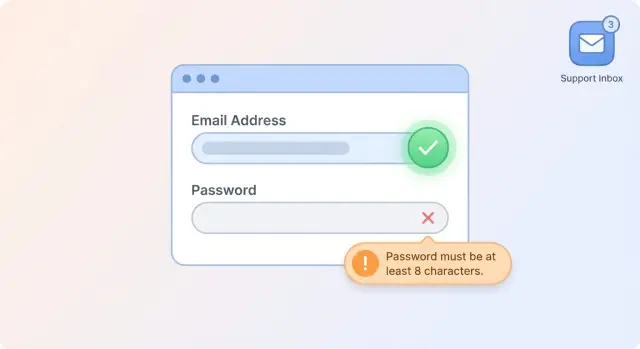
Write error messages people can act on
An error message should answer two questions quickly: what went wrong, and what to do next. If it only says “Invalid input,” people get stuck, try random fixes, and open a ticket.
Use plain language and name the thing the user recognizes. “Card number is too short” beats “Payment validation failed.” “Email must include an @” beats “Error 400.” Keep the tone neutral and specific.
Placement matters as much as wording. Put the message next to the field that needs attention, and keep it visible after Submit. If the problem is in a hidden section (like a collapsed billing address area), bring that section into view and highlight the field.
A useful error message usually includes what’s wrong, how to fix it, the expected format (with an example if helpful), and whether the field is required.
Examples:
- Signup: “Password must be at least 12 characters and include a number. Example: bluebike2026.”
- Billing: “Postal code must be 5 digits. Example: 02139.”
Skip error codes and internal terms. If you must log technical details, keep them behind the scenes and show the user a human message.
Make the happy path easy and forgiving
Most form tickets happen when the form makes people feel like they’re doing something wrong. Often the fix is simple: make the most common path work with the least effort, and be forgiving when someone types like a normal human.
Start with sensible defaults so users do less work. If you can infer a likely country, currency, or timezone from the browser or previous choices, prefill it. Keep it easy to change.
Small input helpers prevent a surprising number of mistakes. Auto-formatting removes the need to guess the right format while still storing clean data. For example: format card numbers with spaces as someone types but store only digits; accept spaces or dashes in phone numbers; allow paste where people paste (one-time codes, API keys, addresses); add show/hide password so users can spot typos.
Multi-step flows fail when users lose context. Keep short, inline hints close to the field they relate to. On a billing step, a hint like “We use your billing address to verify your card” answers a question before it turns into a ticket.
Finally, confirm success clearly and give one obvious next action. “Saved” is vague when someone is anxious. Say what happened and what to do now, such as “Payment method added. Next: review your plan” or “Account created. Next: check your email to verify.”
Do not forget accessibility and localization basics
If a form works only for mouse users, English readers, or people with perfect vision, it quietly creates mistakes. Those mistakes turn into support tickets.
Start with labels. Every field needs a real label that stays visible. Placeholder text disappears when someone types, and screen readers often treat it poorly. If you need extra context, add one short helper sentence under the field.
Keyboard support is another common gap. Many users tab through forms, especially on laptops. Make sure the tab order follows the visual order and that the focused field is obvious. If you use custom dropdowns or date pickers, test them without a mouse.
A quick accessibility check:
- Every input has a visible label tied to it
- Focus states are clear
- Error states use color plus text
- Error text sits near the field and is easy to read
- Buttons can be reached and activated by keyboard
Localization basics prevent “it worked for me” bugs. Dates, decimals, and phone formats vary by region. If you accept a date, show the expected format right next to the field, and accept common variations when possible. For numbers, handle commas and periods carefully.
Translations can also be longer than English. Leave room so labels and buttons don’t wrap awkwardly or get cut off. A simple test is to temporarily increase text length by 30-50% and see what breaks.
Example: a billing form that shows “MM/DD/YYYY” but rejects “DD/MM/YYYY” will generate tickets. Accept both when you can. If you can’t, say exactly what to enter.
Common traps that create more tickets
Most form-related tickets come from people getting stuck, guessing what you meant, and hitting a dead end.
One common mistake is asking for too much, too soon. When the first screen has eight required fields, people abandon or type anything just to get past it. If you truly need the data, collect it later, when there’s trust and context.
Another ticket factory is validation that waits until final submit. Someone fills out a long form, clicks “Create account,” and suddenly sees five errors they could have fixed earlier. Inline checks (or checks on field blur) prevent surprise.
Other traps that quietly create extra work:
- Making every field required, even when it’s “nice to have”
- Showing errors only after submit
- Losing error state on reload so users have to re-enter everything
- Setting rules that are stricter than real life (names, addresses)
- Rejecting input for tiny formatting differences (spaces, dashes, capitalization)
Strict rules deserve special attention. People have hyphens in names, apartment numbers in addresses, and different phone formats. If you can normalize input (trim spaces, accept common separators, auto-add a country code), do that instead of blocking.
A small example: a billing form that requires “MM/YY” will trigger tickets if users type “MM/YYYY” or include a space. Accept both, then store one standard format.
Quick pre-launch checklist for forms and messages
Before you ship, do a quick pass that looks at the form the way a tired, distracted user will. Ten minutes of testing can prevent days of back-and-forth.
The essentials to verify
Start with clarity. If a field is required, mark it right next to the label (not only in a footnote). Make sure the label says what the user should type, not internal jargon. If you use examples, keep them realistic (for example, “[email protected]” instead of “[email protected]”).
Then check error messages. An error should tell people what happened and what to do next. “Invalid input” isn’t enough. “Use at least 8 characters” or “Card number must be 16 digits” is.
A simple checklist:
- Required fields are clearly marked and easy to spot
- Each error message says exactly how to fix the problem
- Validations match backend rules (same formats, same limits)
- The form works well on a phone (typing, scrolling, tapping)
- Success states are obvious and don’t wipe what the user entered
Two quick tests that catch most issues
First, try to break the form on purpose: leave required fields blank, add spaces before and after inputs, paste long text, and use an email like “[email protected].” If the UI accepts it but the server rejects it (or the opposite), you’ll get tickets.
Second, run the full flow on mobile using thumbs only. Watch for tiny tap targets, the keyboard covering important fields, and confusing focus jumps. After a successful submit, users should see a clear confirmation and shouldn’t have to retype everything if they need to go back.
Example: fixing a signup and billing form
A common support headache is a simple flow: create an account, add a card, hit “Start trial.” The “before” version looks fine to the team, but it creates tickets because it’s vague and unforgiving.
Before:
- The signup form has labels like “Name” and “Password” with no hints.
- The billing form uses “ZIP” even for non-US users.
- Errors are generic: “Invalid input” or “Something went wrong.”
After, a few small changes can cut tickets without redesigning the whole page.
What changed (and why it worked)
Clearer labels and examples remove guesswork. Inline validation catches issues early, right next to the field, instead of after submit.
- “Full name (as shown on your card)” with a short example.
- “Password (12+ characters)” plus a strength hint.
- “Postal code” (not “ZIP”), and only require it when your payment provider needs it.
Rewritten messages people can act on:
- Instead of “Invalid password” -> “Password must be at least 12 characters and include a number.”
- Instead of “Card declined” -> “Your bank declined this charge. Try another card or contact your bank. No money was taken.”
- Instead of “Invalid ZIP” -> “Enter a valid postal code for your billing address (letters and numbers are OK).”
How to measure improvement in a week
Track two numbers before and after the change: form abandonment rate and tickets related to signup and billing (“how do I,” password issues, postal code errors, card failures).
Within 7 days, look for fewer retries per user, fewer failed submissions, and fewer tickets that mention passwords, postal codes, or card errors.
Next steps: monitor, iterate, and get help when forms are broken
You don’t need a perfect form on day one. You need a feedback loop that shows where people fail, and a habit of fixing the highest-impact problems first.
Measure the trouble spots in a way that’s useful and privacy-safe:
- Track ticket volume by step (signup, address, payment, password reset)
- Log validation failures by field name and a safe reason (for example: “postal_code too short”)
- Watch abandonment points (where users quit)
- Tag tickets that mention specific errors so you can group them later
Avoid logging full input values for sensitive fields. It’s usually enough to know that a postal code failed validation, not what the user typed.
Then iterate like you would on a product feature. Any release that touches forms should include a quick copy review: labels, helper text, and error messages. Small wording changes remove a surprising amount of confusion, especially when paired with better defaults (auto-format phone numbers, accept spaces in card numbers, trim extra whitespace).
If your app was generated by an AI tool and forms keep breaking in production, the issue is often deeper than copy: mismatched client and server validation, broken auth flows, exposed secrets, or unsafe input handling. If you’ve inherited a project like that, FixMyMess (fixmymess.ai) can run a free code audit to pinpoint what’s failing, then repair and harden the code with expert human verification. Most projects are completed within 48-72 hours, which helps stop recurring tickets before they pile up.
FAQ
What’s the fastest way to figure out which form issues are causing tickets?
Start with the tickets. Pull the last 20 that mention signup, checkout, billing, or password reset, and group them by step and field. Fix the 3–5 issues that block completion most often first, because they usually cause the largest drop in tickets.
How do I write form labels that people don’t misinterpret?
Use everyday words and say what the user should type, not what your team calls it internally. Put the key word first and add a short qualifier only when it prevents a common mistake, like “Company name (as it appears on invoices).”
When should I add helper text, and how long should it be?
Add helper text only where people frequently guess wrong or where the wrong value causes real problems later. Keep it to one short sentence and include an example for tricky formats, like dates or phone numbers, so users can copy the pattern.
Should validation happen while users type or only after they submit?
Validate as someone types or when they leave the field, but avoid showing errors while they’re mid-typing. The goal is early feedback without nagging, so users can fix mistakes before they hit Submit and feel stuck.
Why do I need server-side validation if the browser already checks inputs?
Always validate on the server even if the browser validates too. Client-side checks are easy to bypass, and server-side validation protects your data and reduces weird mismatches where the UI accepts something the backend rejects.
What makes an error message actually useful to users?
Tell them what went wrong and what to do next using the field name they recognize. Include the rule and an example when it helps, like “Postal code must be 5 digits. Example: 02139,” instead of vague messages like “Invalid input.”
How can I make forms more forgiving without letting bad data in?
Make validation forgiving by normalizing input instead of rejecting it. Trim extra spaces, accept common separators (spaces or dashes), and store a clean format behind the scenes so normal human typing doesn’t turn into a blocker.
What are the easiest “happy path” improvements that reduce tickets?
Give sensible defaults and small input helpers that reduce effort. Prefill likely country or timezone when you can, allow paste where people paste (codes, addresses), and offer show/hide password so typos don’t become support tickets.
What accessibility basics matter most for reducing form-related tickets?
Start with visible labels, clear focus states, and errors that use text plus color. Make the full form work by keyboard, and test custom dropdowns and date pickers without a mouse, because hidden accessibility issues often show up as “it won’t let me submit.”
When should I get help fixing forms instead of just tweaking copy and UI?
If the form was generated quickly by an AI tool and later patched, problems are often deeper than copy, like mismatched client/server validation, broken auth, or unsafe input handling. FixMyMess can run a free code audit to pinpoint what’s failing and repair and harden the code with expert human verification, usually within 48–72 hours.