SaaS onboarding flow: 3 steps to value + drop-off tracking
Plan a SaaS onboarding flow that gets users to value in three steps, and set up simple tracking to see where people drop off.
What onboarding is really for (in plain terms)
A SaaS onboarding flow has one job: get a new user to a real result quickly so they can think, "Okay, this works for me." Most people decide whether to keep going in the first 2 to 5 minutes.
In that short window, users look for three things:
- A clear promise (what they’ll get)
- A simple next action (what to do now)
- A visible payoff (proof it worked)
If any of those are missing, they hesitate, open another tab, or leave.
"Sign up" isn’t the same as value. Creating an account is effort. Value is the moment the product does something useful: a report generated, a task completed, a file processed, a teammate invited and active, or a first result saved.
People abandon onboarding for boring, practical reasons. They hit a long form that feels unrelated to their goal. They can’t tell what to do next without reading a wall of text. They do the work but see no outcome (an empty state with no guidance). They get blocked by errors (email verification loops, broken auth, payment required too early). Or they don’t trust what they’re seeing (unclear permissions, noisy error screens).
AI-built apps often add extra steps by accident. Auto-generated UI can turn one simple action into three screens, add duplicate confirmations, or ask for configuration before the user even knows what it controls. It can also ship with brittle basics, like flaky login, confusing redirects, or forms that don’t validate well.
A quick example: if your product is "turn notes into a proposal," onboarding shouldn’t start with picking templates, setting up a workspace, and inviting teammates. It should start with pasting notes and seeing a proposal appear.
Define value and your activation moment
Onboarding only works when you’re clear on what "value" means for the user. Not for your roadmap. Not for your demo. For the person who just signed up and is deciding whether to stay.
Start by writing the user’s main job-to-be-done in one sentence. Use plain words and a real verb.
Examples:
- "I need to collect payments from clients without chasing invoices."
- "I need to turn messy meeting notes into a clear plan I can share."
Next, pick one measurable outcome that feels like progress. This isn’t a feature (like "connected Google"). It’s a result the user can see.
Good outcome shapes include creating a first project with real content, importing contacts and sending a first message, connecting one data source and seeing a first report, or inviting one teammate and assigning a task.
Now write your promise as a time-bound sentence: "After X minutes, the user can Y." Keep it honest. If the best case is 2 minutes but the typical case is 8, use 8.
Example: "After 7 minutes, you can send your first invoice and see the payment link."
Finally, pick one primary persona to design for first. Trying to onboard "founders, teams, agencies, and enterprises" all at once usually creates a bland flow that fits no one.
Define your activation moment: the first time they get that promised result. Everything before that is setup, and setup should be as short as you can make it.
If your app was built quickly with AI tools and the activation step breaks (auth errors, missing permissions, failed imports), users will drop off before you learn anything. Make the basics reliable first.
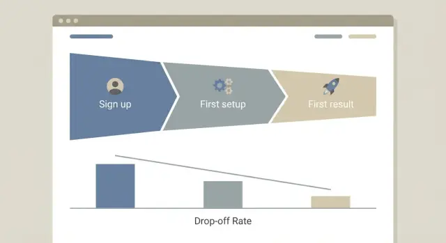
Plan the first three steps to value
A good onboarding flow gets a new user to their first real result fast. Think in three small steps where each step takes 60 to 90 seconds, not five minutes and a long form.
Start by writing down the exact first result you want them to see (a report, a generated draft, a saved project, a scheduled task). Then design backward.
Step 1: Account creation with less friction
Keep signup short. Ask only what you need to create an account and continue. You can learn company size, role, or use case later.
A simple rule: if a question doesn’t change what the user sees in the next 2 minutes, postpone it.
Step 2: Minimum setup to reach the first result
This is the smallest setup that makes the product work: connect one data source, choose one template, or create one project. Don’t stack optional settings here.
Good minimum setup feels like progress, not configuration.
Step 3: Show the first result and point to the next action
Show something concrete on the screen, even if it’s a small win. Then make the next action obvious: "Save", "Invite a teammate", "Schedule", or "Run again". Avoid dropping people onto a blank dashboard.
What to delay until after activation: team invites and roles, billing details (unless required), long profile questions, advanced settings, and long product tours.
Example: a scheduling tool can do (1) email signup, (2) pick one calendar to connect, (3) show the first booking link with a clear button to share it.
Map the journey and remove unnecessary steps
Onboarding is easier to improve when you can see it as a simple path: what the user sees, what they decide, and what they do next.
Write down every screen between first visit (or signup) and your activation moment. Include the small stuff: email verification, plan selection, "create workspace", permissions, empty states, and every modal.
Then mark each step as required or nice-to-have. Required means the user can’t reach value without it. Nice-to-have means it can wait. If a step is "required" only because of internal preferences (like asking for company size early), move it later.
Dead ends are where onboarding quietly fails: the user finishes a step but doesn’t know what to do next, or lands on a screen with no clear next action. Common dead ends include a success message with no button to continue, an empty dashboard with no suggested first task, a modal that closes and dumps the user back into confusion, or a connect step with vague errors and no fallback.
If you used AI tools to build parts of the app, look for duplicate flows (two different "create project" screens), extra modals, and repeated setup questions. These often sneak in when screens were generated in separate prompts.
Turn your map into a checklist for review: what stays, what moves later, what gets deleted, and what needs clearer "next step" guidance.
Set up tracking that tells you where users drop off
If you only track page views, you’ll know where people went, not what they tried to do. For onboarding, you need a small set of events that describe intent and progress.
Define 5 to 10 events with clear names and one meaning each. Write a one-line definition for every event so your team doesn’t argue about it later.
A simple starter set for most SaaS products:
signup_started(user opened the signup flow)account_created(account exists and can log in)setup_completed(finished the minimum required setup)first_result_reached(saw the first valuable output)invited_teammateorconnected_integration(only if it’s truly required for value)
Add a few properties so you can slice drop-offs without drowning in data. Keep it small: plan (free, trial, paid), role (owner, member), source (ads, organic, referral), and device (desktop, mobile) are usually enough.
A common tracking bug in onboarding is double counting. Make sure events fire once per action, not once per page render. This matters even more in AI-built apps, where components can re-mount and send the same event multiple times.
Do a quick sanity check: complete onboarding yourself twice and confirm the counts match what you did. If you see two account_created events for one signup, fix that before you look at funnel data.
Turn events into a drop-off funnel you can act on
A funnel is just a story told with numbers: how many people start, how many finish, and where they quit. Keep it boring on purpose so the whole team can repeat it.
Define one path from intent to value. Start with the first clear action (like clicking "Create account") and end with the moment you consider "activated" (like "First project created" or "First report generated").
A simple setup that stays useful as you iterate:
- Step 1: Signup started
- Step 2: Signup completed
- Step 3: Activation started (first key action begins)
- Step 4: Activation completed (your activation event)
- Track time to first result for people who activate
Add a few breakdowns you can actually act on: traffic source (ads vs organic), device (mobile vs desktop), and new vs returning users. If mobile drop-off is twice as high at "Signup completed", you have a clear place to look.
Set simple targets so the funnel tells you if you improved or got worse. Two numbers usually do the job: step conversion (for example, 60% from signup completed to activation completed) and time to first result (for example, under 5 minutes).
Add one alert for sudden change, like a sharp drop in conversion at a single step after a release. That often points to a broken form, a failing API call, or an auth issue.
Review weekly. A 20-minute check is enough if you always answer the same questions: what step fell, for whom, and what you’ll change next.
Add lightweight signals beyond analytics
Analytics can tell you where people drop off, but it rarely tells you why. A few small, human signals fill the gap without turning onboarding into a survey.
Ask one simple intent question
Right after signup (or on the first screen), add one optional question: "What are you trying to do today?" Keep it multiple choice with a short "Other" option.
Use it to personalize the next screen, and to spot mismatches. If many users pick "Invite my team" but your onboarding pushes "Connect a data source" first, that mismatch often shows up as "mysterious" drop-offs.
Capture friction at the moment it happens
When someone abandons setup (closes the tab, hits "Skip," or stalls for 60 to 90 seconds), show a small prompt that’s easy to ignore:
- "What blocked you?" (confusing, too long, error, not what I need)
- Optional one-line text box
Then watch 5 to 10 real sessions (or short replays) each week. You’re not redesigning everything based on one strange user. You’re looking for repeated confusion points, like a button label people misread or an error message that sends them in circles.
Bring support into the loop. Tag tickets by the onboarding step the user was on when they got stuck (Step 1 signup, Step 2 connect, Step 3 first result). After a week, patterns show up that dashboards miss.
Common onboarding mistakes (especially in AI-built apps)
Most onboarding problems come from good intentions. You want context, clean data, and things "set up right." But every extra step adds a new place for someone to quit.
One common mistake is asking for too much too early. If the first screen after signup demands company size, role, full profile, and team invites, many people bounce. Collect only what you need to deliver the first result. Everything else can wait.
Another quiet killer is unclear next steps. Buttons like "Initiate workspace provisioning" or "Configure pipeline" sound precise to the builder, but confusing to a new user. If someone can’t predict what happens when they click, they hesitate.
AI-built apps also tend to forget the unglamorous parts: error states and empty states. A failed login, an email that never arrives, a blank dashboard with no guidance, or a form that fails silently can end a trial in seconds.
AI-generated auth and permissions issues
Authentication and permissions generated by tools like Lovable, Bolt, v0, Cursor, or Replit often work in the happy path, then break on edge cases. Watch for:
- Password reset emails that never send
- Users stuck in a redirect loop after login
- "Unauthorized" errors after refresh
- Admin-only pages exposed to normal users
- Secrets accidentally shipped to the client
Measuring the wrong goal
If you celebrate signups, you can miss the real problem: nobody reaches activation. Two hundred signups looks great, but it doesn’t matter if most users never connect their data or create a first project.
Track the first meaningful outcome, not account creation.
Quick checklist before you ship changes
Before you change onboarding, do one dry run like a new user: incognito window, no saved data, clean account. Time it. If you can’t reach a real first result fast, tracking won’t save the experience.
Checklist before you push to production:
- Can a brand-new user get a meaningful result in under 3 minutes without reading a long guide?
- Can you postpone anything that’s nice-to-have (profile photo, team invites, billing details, extra settings) until after the first win?
- Does every screen have one clear action, and after that action, a clear success message (not just a spinner or subtle UI change)?
- Do your core events fire correctly in production: signup completed, setup completed, activation event, first value delivered?
- Can you name the top drop-off step and the most likely reason (confusing copy, too many fields, missing permissions, slow load, error)?
If you’re unsure about drop-off, do a reality check: watch 3 people do the flow (or record your own session) and write down where they hesitate. The top drop-off step is often the one that asks for effort before trust.
One more guardrail: verify that the events you rely on don’t break after deployment. AI-built apps often ship with brittle auth, hidden errors, or inconsistent event names.
Example scenario: from signup to first result in 3 steps
Imagine a simple reporting SaaS. It has one report template (Weekly KPI Summary) and one sample dataset (Demo Store). The goal is to get a first chart on screen in under 2 minutes without asking the user to connect anything yet.
A 3-step path to the first result:
- Step 1: Create account (email or Google). After signup, the user lands on a "Start report" screen.
- Step 2: Pick "Demo Store" data (preloaded). One click, no uploads, no API keys.
- Step 3: Generate the report (template is preselected). The first result is a dashboard with three tiles (a revenue trend line, a top products bar chart, and one short insight sentence).
To see where people drop off, track one event per step, plus one success event:
signup_completeddemo_dataset_selectedreport_generated(activation event)report_viewed_10s(guards against empty loads or instant bounces)
In this setup, a common drop-off is between selecting the dataset and generating the report. That usually means the "Generate" action isn’t obvious, the page feels slow, or the app errors when building the report.
One useful iteration: auto-generate the report right after dataset selection, then let users tweak later. That removes a decision and turns Step 3 into the default.
Next steps: ship, measure, and fix what breaks
Choose one clear activation event and build onboarding around it. Then ship the simplest three-step path that gets a new user to that moment. You learn faster with something real in front of users.
A practical plan:
- Pick one activation event you can measure (for example: "created first project" or "generated first report").
- Make the three steps obvious (signup -> setup -> first result).
- Track each step with one event name and one user ID.
- Launch it to everyone, not just internal testers.
After you ship, give the data time to settle. Review after about 100 signups, or after 1 to 2 weeks if volume is low. Find the single biggest drop-off step and fix that first. If 60% leave before connecting a data source, don’t redesign the whole product. Tighten that one screen: fewer fields, clearer copy, better defaults.
Sometimes the blocker isn’t UX, it’s the code. AI-built apps often work in demos but fail during real onboarding, where auth, state, and analytics need to be reliable.
Signs you need focused remediation: signups fail randomly or sessions don’t persist, events fire twice (or not at all), sensitive keys show up in the client, or small changes break unrelated screens.
If that sounds familiar, FixMyMess (fixmymess.ai) specializes in diagnosing and repairing AI-generated apps so onboarding-critical paths like auth, tracking, and security behave in production. They offer a free code audit to surface what’s broken before you pile more changes on top.
FAQ
What is onboarding actually for in a SaaS product?
Your onboarding flow should get a new user to a real result fast so they trust the product and keep going. The result should be something they can see on screen, not just an account created.
How fast should a new user reach value?
Aim for a visible “first win” in the first 2 to 5 minutes, because that’s when many users decide whether to continue. If your product can’t deliver the full win that fast, show a smaller but real payoff that proves it works.
What’s the difference between “signup” and “value”?
Value is the moment the product does something useful for the user, like generating a report, creating a real project, or producing an output they can save or share. Signup is just effort and doesn’t prove the product works.
How do I define my activation moment?
Write the user’s main job in one plain sentence, then choose one measurable outcome that proves progress. Turn it into a promise like “After X minutes, you can Y,” and use that as your activation target.
What are the simplest “three steps to value” I should design for?
Keep it to three steps: create an account with minimal friction, do the smallest setup required, and show a first result with one obvious next action. Anything that doesn’t help reach that first result should move later.
What should I delay until after activation?
Delay anything that doesn’t change what the user sees in the next couple of minutes, like team invites, long profile questions, advanced settings, and most product tours. If it’s not required to reach the first result, it’s usually better after activation.
How do I find and remove unnecessary onboarding steps?
Map every screen from first visit to activation, then mark each as required or nice-to-have. Remove or merge anything nice-to-have, and fix dead ends where the user finishes a step but doesn’t know what to do next.
What onboarding events should I track (without overdoing it)?
Track a small set of events that represent intent and progress, like signup started, account created, setup completed, and first result reached. Make sure each event fires once per real action, not on every page render or component remount.
How do I turn events into a drop-off funnel I can act on?
Build one clear path from the first action to your activation event, then measure conversion at each step and time to first result. Add simple breakdowns like device and traffic source so you can spot one specific bottleneck to fix.
When is drop-off a code problem (especially in AI-built apps), and what should I do?
If signups fail, sessions don’t persist, events double-fire, secrets appear in the client, or small changes break unrelated screens, fix the core code before tweaking UX. FixMyMess can diagnose and repair AI-generated apps so onboarding-critical paths like auth, tracking, and security work reliably, starting with a free code audit.