Simple analytics dashboard: 5 clear metrics with AI tools
Build a simple analytics dashboard with AI tools by choosing 5 precise metrics, defining formulas, and adding checks so numbers stay trustworthy.
What a “simple” dashboard should do
A simple analytics dashboard isn’t “a page with charts.” It’s a small set of numbers you trust, where each number answers a real question you have this week.
Dashboards get confusing when the basics are fuzzy: one chart uses “last 7 days” and another uses “this month,” a table quietly excludes some users, or a metric name hides a messy definition. Then you spend time arguing with the dashboard instead of making a decision.
“Mystery numbers” have a few common forms. Total signups in the dashboard don’t match a database export. A spike appears after a deploy, but only on one widget. Or “active users” changes depending on the page you’re on because each page uses a different rule.
A simple analytics dashboard should do four things consistently:
- Use one clear time range and one time zone across the whole page.
- Use plain-language metric names, with a precise definition behind each one.
- Make filters obvious (and ideally minimal), so you always know what you’re looking at.
- Be easy to verify, so a person can reproduce the number from raw events or database rows.
To keep scope under control, pick one product, one primary audience, and one time zone before you build anything. For example: “Web app only, self-serve trial users, UTC time.” That single choice prevents a lot of silent mismatches later.
If you’re using AI tools to build the app and the analytics, this matters even more. AI-generated code often mixes tracking events, duplicates them, or sends slightly different properties from different screens. A “simple” dashboard can be your early warning system, but only if the numbers are defined tightly and can be checked.
Start with one question and one key action
A simple analytics dashboard starts with a single decision you need to make soon. Not a vague goal like “grow,” but something you can actually do this week: ship a feature, fix a drop, or sell harder to a specific segment.
For example: “Should we pause new features for two days and fix onboarding?” or “Is the trial converting well enough to increase ad spend?” If your dashboard can’t answer your one question quickly, it’ll turn into a pile of charts.
Next, define your product’s key action in one sentence. This is the one thing users came for, not a vanity step like “visited the homepage.” A good key action is specific and testable, like “A user connects their workspace and successfully generates their first report.”
Choose one reporting cadence and stick to it. Daily works when you have enough volume and you need fast feedback. Weekly is better for early products where daily numbers jump around and cause false panic. Pick one and keep it consistent so trends mean something.
Also be honest about your data sources. Write down what you actually have today, not what you wish you had: app events, database tables (users, orders, sessions), payments/subscriptions (trials, invoices, refunds), support or bug data (tickets, error logs), and marketing sources (campaign tags, lead lists).
If your app was built quickly with AI tools and tracking is messy, start with sources that are usually harder to fake: payments and the database. They tend to be less noisy than events.
How to define a metric so it can’t drift
A metric drifts when two people can say the same word but count different things. The fix is a definition so clear you could hand it to someone new and they would get the same number.
Start with the metric name, then write a plain-language meaning and one sentence on why it matters. Keep it tied to a decision. If the number goes up or down, what will you do?
Then lock the formula. Be explicit about what you count and what you exclude. “New signups” sounds simple, but are you counting invited users, SSO users, deleted accounts, or test accounts? If you don’t say, your “simple dashboard” turns into a debate.
Time and units matter just as much as the formula. “Per day” can mean calendar day in one time zone, a rolling 24-hour window, or “trailing 7 days averaged daily.” Pick one and state it.
Decide which breakdowns are allowed. Breakdowns (dimensions) are useful, but they multiply confusion. If you allow plan and channel, say so. If you don’t allow device because tracking is messy, say that too.
A short template that prevents most drift:
- Name + meaning: one sentence a non-analyst understands
- Why it matters: the decision it supports
- Formula: tables/events used, filters, exclusions
- Unit + window: e.g., users per day, trailing 7 days, UTC
- Allowed dimensions + owner: what you can slice by, who approves changes, and where it’s documented
Concrete example: “Activated users (T7)” could mean “unique users who created at least 1 project within 7 days of signup, excluding internal emails and test accounts; reported weekly as trailing 7 days; dimensions: plan and signup channel only; definition owned by the product lead, edits tracked in the metric spec.”
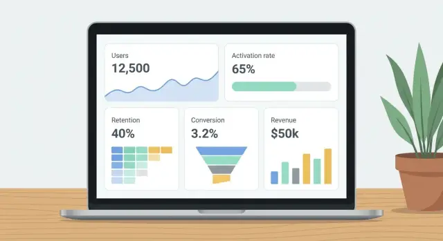
Pick five metrics that cover the whole funnel
A simple analytics dashboard works best when it follows the user journey end to end. If you only track signups, you’ll miss whether people actually use the product. If you only track revenue, you’ll miss where the leak started.
Pick five metrics that each answer a different question. Together they cover acquisition, first value, habit, and money, without turning your dashboard into a wall of charts.
The five metrics (and what each one tells you)
- Active users: How many people did the key action at least once in the period? This is your reality check for actual usage, not just logins.
- Activation rate: Of the people who signed up, how many reached the key action within N days? This shows whether onboarding and first-run experience work.
- Retention: For a cohort (like users who signed up last week), how many returned and did the key action again on day 7 or week 4? This separates curiosity from real value.
- Conversion rate: Of the users who had a fair chance to pay (trial users, or all signups), how many became paid? The denominator matters more than the percentage.
- Net revenue: How much money did you keep after refunds, with clear rules about taxes and fees? This stops arguments like “revenue is up” when cash isn’t.
A quick example to keep it concrete
If your key action is “create and share a dashboard,” then an “active user” is someone who completes that action at least once in the week. Activation is whether new signups do it within, say, 3 days. Retention is whether they do it again next week.
If your app was built with AI tools, double-check event names and user IDs early. Broken auth, duplicate users, or missing events can turn good metrics into mystery numbers fast.
Precise definitions for each metric (with formulas)
A simple analytics dashboard only works if each number has one meaning and stays stable over time. Write the definition next to the chart in plain words, then lock the logic in code so it can’t drift.
Here are five common metrics with definitions that remove the usual ambiguity.
Active users (DAU or WAU): Count users who triggered your “core activity” event (for example created_report or sent_message). Deduping rule: 1 user counts once per day (DAU) or per rolling 7 days (WAU), even if they do the event 20 times. Identity rule: if logged in, key by user_id; if anonymous, key by anonymous_id. If a user logs in later, merge past anonymous events into that user_id starting from the first time you can reliably link them.
Activation rate (N-day activation): Define a “new user” as a unique user_id with first signup timestamp in the period. Pick N based on your product’s natural first-use cycle (often 1 day for simple tools, 7 days for tools that need setup). A new user is “activated” if they complete the activation event within N days of signup. Formula: Activation rate = Activated new users / New users.
Retention (cohort retention): Cohort date is signup date (not first purchase, not first visit). Comparison window is a fixed window after signup, like “returns in days 7-13.” If someone is inactive for months and comes back, they still belong to their original cohort; they count as retained only in the specific window you’re measuring. Formula: Week-1 retention = Users active in days 7-13 / Users who signed up in cohort week.
Conversion to paid: Decide what counts as “paid” and be consistent with trials, upgrades, and failed payments. A practical rule is to count a conversion when the first successful payment settles (not when a trial starts). Handle upgrades/downgrades separately as expansion or contraction, not new conversions. Exclude failed payments from the numerator. Formula: Paid conversion rate = Users with first successful payment / New users.
Revenue (choose cash or accrual, then stick to it): For an ops dashboard, use net cash collected. Definition: sum successful charges minus refunds and chargebacks, recorded on the date they happen. Currency: store amounts in original currency plus amount_usd using an agreed FX rate on transaction date. Formula: Net revenue = Sum(charges) - Sum(refunds) - Sum(chargebacks).
If your AI-built app has messy identity or payment logic, these definitions will surface gaps fast and help you fix the source, not just the chart.
Design the dashboard so numbers explain themselves
A simple analytics dashboard should answer questions without extra meetings. If a number changes, people should see what changed, over what time window, and compared to what.
Use one clear card per metric
Give each metric its own card with a single big number. Add a small trend line (sparkline) so the reader can tell if it’s moving up, down, or staying flat.
Put the time window directly on the card, not hidden in a dropdown. “Last 7 days” or “This month to date” removes guessing and prevents people from comparing different ranges by accident.
Use one comparison and label it in plain words: “vs previous 7 days” or “vs last month.” More comparisons usually create debates about which one “counts.”
Make context visible: filters and definitions
Place filters at the top (date range, plan, region, platform). Right under them, show active filters as a short sentence: “Filters: US only, Pro plan, iOS.” This is the fastest way to stop “Why is my number different from yours?”
Every metric should also have a tiny “Definition” tooltip that repeats the formula in one sentence. Keep it specific.
Example:
- Activation rate: 42% (Last 7 days) | vs previous 7 days: +3%
Tooltip: “Activation rate = users who completed onboarding within 24 hours divided by users who signed up in the same period.”
If your dashboard was generated quickly with AI tools, verify that the UI matches the real queries. It’s common for labels, filters, and formulas to drift apart over time.
Step by step: build it with AI tools, then verify it
AI can help you move fast, but analytics is where small errors turn into big decisions. Let AI draft the work, then verify every assumption with real data.
A practical build flow
-
Write a mini spec for each metric: the exact event names or database tables, the user identifier, the timestamp field, and the rules (for example, “exclude internal users,” “count each user once per day”). If you can’t point to a source, the metric isn’t ready.
-
Ask your AI tool to draft the event tracking plan and the SQL for each metric. Then review it line by line. Check joins, filters, and time windows. A common AI mistake is counting rows (like pageviews) when you wanted unique users.
-
Create one “metrics layer” that everything uses: saved queries, database views, or a single file of definitions. This prevents the same metric being calculated three different ways across charts, exports, and emails.
-
Build your five dashboard cards from the metrics layer only, and lock the defaults: time range (like last 7 days), timezone, and key filters (like “exclude admins”). Make the title include the unit, such as “Activation rate (%)” not just “Activation.”
-
Add trust signals: a “last updated” timestamp, simple alert thresholds (for example, “Activation rate drops below 15%”), and a backfill check for the last 30-90 days. Backfill often reveals missing events after a deploy, a broken client tracker, or a server job that stopped running.
If your app was built with AI and the tracking code is messy, you may uncover duplicated events, missing user IDs, or logic that breaks in edge cases. Treat those as product bugs.
Common mistakes that create “mystery numbers”
Mystery numbers happen when a metric looks clean on the chart but the definition is fuzzy, or the data quietly changes underneath you. A simple analytics dashboard only works if every number is tied to one clear action and one clear population.
A common trap is counting “users” using pageviews or sessions instead of the key action. If your goal is “created a project” or “sent a message,” then counting visits inflates progress and hides churn.
Another trap is a denominator that shifts without warning, like conversion rate calculated on all signups one week and only verified accounts the next. The chart still moves, but it’s no longer the same metric.
Time handling creates subtle errors. Mixing server UTC timestamps with a local timezone can push events across midnight, causing off-by-one day spikes and dips. It gets worse around daylight savings changes.
Identity issues also cause double-counting. If you track an anonymous user, then a logged-in user, and never merge them, one person can look like two. Your “active users” and funnel steps stop lining up.
Revenue gets misread when refunds are ignored or test transactions are included. A single internal test card can make “growth” look great for a day.
AI-generated tracking code can double-log events, especially when added in multiple components or fired on both page load and button click. If you see event counts higher than pageviews, suspect duplicate logging.
Quick signs something is off:
- A metric jumps after a deployment, but user behavior didn’t change.
- Daily totals differ between “today” and “yesterday” views.
- Event counts exceed possible actions per user (like 5 signups per person).
- Conversion rates improve while revenue or retention stays flat.
- Small filter changes cause huge swings.
Quick checklist to trust your dashboard
Trust comes down to one goal: every number on your simple analytics dashboard should be explainable, reproducible, and stable. If you can’t recreate a metric from raw data, treat it as a bug, not a “data quirk.”
Before you share the dashboard, run a short QA pass:
- Reconcile totals with a direct query: Pick one metric and one day. Compare the dashboard total to a straightforward database query over the same events/rows. If they don’t match, stop and find the gap (joins, dedupe rules, missing filters, or late-arriving events).
- One-sentence explanation test: For each metric, write a single sentence that includes the exact formula and the data source. If you can’t do it without hand-waving, the definition isn’t finished.
- Make time rules visible: Show the time window, time zone, and key filters on the screen (not hidden in settings). “Last 7 days” means different things if it’s rolling vs calendar.
- Use a known-good test journey: Create one test user flow that should increment specific metrics exactly once (for example: sign up -> activate -> pay). Run it, then confirm each metric moves by +1 where expected and doesn’t move where it shouldn’t.
- Exclude noise consistently: Decide how you exclude test accounts, internal traffic, and bots, then apply it the same way everywhere (dashboards, queries, alerts).
Assign a clear owner for metric definitions and keep a simple change log (what changed, when, why). If you’re building analytics on top of an AI-generated app, make this part of your release routine.
Example: a realistic 5-metric dashboard for a small SaaS
Picture a small SaaS that got 500 signups last month. It has a 14-day trial, and the main value happens when someone creates a project (not when they just log in). This is the kind of setup where a simple analytics dashboard stays clear if every number has a strict meaning.
Five metrics that cover the funnel, with definitions that avoid “mystery numbers”:
- Signups: Count of new user accounts created in the selected period.
- Active users (7-day): Unique users who created at least one project in the last 7 days. Logging in doesn’t count.
- Activation (24-hour): % of signups who created their first project within 24 hours of signup. Formula: activated signups / total signups.
- Week-2 retention (cohort): For each signup week cohort, % who created a project during days 8-14 after signup. Formula: retained users in cohort / cohort size.
- Trial-to-paid conversion (14-day): % of signups who started a paid plan within 14 days of signup. Formula: paid within 14 days / total signups.
Now imagine one product change: you add a short “Create your first project” checklist right after signup. That should mainly move Activation (24-hour) because it reduces time to the first project.
It shouldn’t automatically improve week-2 retention or trial-to-paid conversion. If those jump too, it can be real, but it can also be a tracking bug (for example, the checklist fires a project_created event without a real project).
Next steps to keep it accurate (and fix the root issues)
A dashboard is only useful if the numbers stay stable. The most reliable approach is to treat metrics like product code: written down, reviewed, and changed on purpose.
Put every metric definition in one shared doc that anyone can find. Include the exact event name(s), filters, time window, and formula. Then freeze definitions for 30 days. If something feels off, note it, but don’t quietly edit formulas mid-month and call it “cleanup.”
When you want more detail, add one new breakdown at a time (plan, channel, device) and only if you have a decision waiting on it. If there’s no decision, the extra slice usually creates confusion.
A routine that prevents drift:
- Hold a 15-minute monthly metric review to confirm definitions, owners, and data sources.
- If two numbers don’t reconcile, fix tracking or the data pipeline before adding new charts.
- Keep a small QA log of releases, schema changes, and event-name changes.
- Audit tracking and auth flows quarterly, especially in apps built with AI tools.
If you inherited an AI-generated codebase and the numbers keep disagreeing, it often isn’t an “analytics problem” at all. FixMyMess (fixmymess.ai) focuses on diagnosing and repairing AI-built apps, including tracking, identity, and security issues that create mystery numbers in the first place.
FAQ
What time range and time zone should I use for a “simple” dashboard?
Pick one time range and one time zone for the whole page, then stick to it. A common default is a rolling last 7 days in UTC, because it avoids “month-to-date” confusion and reduces off-by-one issues across regions.
If your team operates in a specific local time zone, use that instead, but don’t mix UTC on one chart and local time on another.
How do I choose the one “key action” my dashboard should track?
Start with the decision you need to make soon, then define the one action that proves a user got real value. The key action should be something you can observe in data and explain in one sentence, like “created a project and shared it,” not something vague like “visited the app.”
If you can’t describe the key action without qualifiers, it’s usually a sign you need to narrow scope to one product surface and one audience.
Why only five metrics—won’t that miss important details?
Use five metrics that each answer a different funnel question: usage, first value, repeat value, willingness to pay, and money kept. That’s enough to spot where things break without turning the dashboard into a debate.
If you add more, add them only when you already know what decision they will change.
What’s a good N for activation rate (1-day vs 7-day)?
Pick N based on how long it realistically takes a new user to reach the key action. For simple products, 1 day is often right; for products that require setup, 7 days is usually safer.
Lock N and don’t change it casually, because changing N will make your “activation rate” trend look like product movement when it’s really a definition change.
How should I handle anonymous users vs logged-in users so I don’t double-count?
Define one identity rule and apply it everywhere. A practical default is to count logged-in activity by user_id, anonymous activity by anonymous_id, and merge anonymous history into the user once you can reliably link them.
If you don’t merge, one person can become two “users,” and your funnel steps won’t reconcile even if your product is working fine.
How do I prevent metrics from drifting as the product changes?
Use a single “metrics layer” that every chart reads from, such as database views, saved queries, or one shared definitions file. That’s what stops the same metric from being calculated three different ways in different widgets.
Also put the definition right next to the number (even as a short tooltip) so the label can’t drift away from the actual query.
Can I use AI tools to build the dashboard without breaking the analytics?
Start by writing a mini spec for each metric (source tables/events, timestamp field, dedupe rule, exclusions), then have the AI draft SQL and tracking. After that, verify line by line with real data, because common mistakes include counting rows instead of unique users, or applying the wrong time window.
AI can speed up the first draft, but you still need a human check before you trust the numbers for decisions.
What filters should I include, and how do I keep them from confusing everyone?
Make filters visible and minimal. Put the active filters in plain text on the screen so people can see what they’re looking at, like “US only, Pro plan, iOS,” and keep defaults consistent.
Hidden or inconsistent filters are one of the fastest ways to create “mystery numbers,” especially when different people view the dashboard with different saved settings.
How do I verify the dashboard numbers are actually correct?
Run a quick reconciliation on one metric for one day: compare the dashboard number to a direct query over raw events or rows using the same time window and exclusions. If they don’t match, treat it like a bug and fix the logic before adding new charts.
Also run a known-good test journey (signup, activate, pay) and confirm each metric moves exactly when it should, and not when it shouldn’t.
When should I stop tweaking charts and fix the underlying AI-generated code instead?
If your app was generated quickly and you see duplicated events, broken auth, exposed secrets, or inconsistent user IDs, the dashboard will keep producing “mystery numbers” no matter how nice the charts look. In that case, fix the source code and data flow first.
FixMyMess helps diagnose and repair AI-built apps so tracking, identity, and payments behave consistently, and your metrics become reproducible instead of arguable.